Showing posts with label Websites. Show all posts

Project Review: Launch City PART VIII[ 8th]-The Target Jukebox Design 1999.

Here is the original final shot for Launch CD-zine Issue #40 from 1999 @ 640 x 480 the size limit at the time fro shockwave to run smoothly.


I did a quick open and re-render at a higher rez to show some details[missing a few maps though after 14 years...]


Here is the main screen shot in geometry showing the model details I added in.


The set was a two wall configuration and I built a little conduit with the parked gum pushed up in the crack.


Here is a shot of the full to the floor jukebox as geometry for Launch.com

 Launch City Part VIII
The Target Jukebox design for Issue #40

Client: Launch Media Inc.
Art Director: Myself
Project Date: 1999

In this 8th post on LAUNCH city, I am posting work done on a jukebox built out for a Target sponsored space with a fully animated 3D jukebox.

This was one of my very first projects I worked on when I joined the three man team as Art Director in 1999. I love to model in 3D, and that seems to be something that many people do not like. 
 
To me the fun part is the build itself. I love the process of construction. This may be due to the fact that I am an avid woodworker, copper smith, and I love to sculpt and create, so naturally I would love virtual building too.
 
I made the model close to, but not exact to a famous iconic Juke box from the 50's for the project, and I passed it over to Cayce Justus and he skillfully rigged it up and animated the arm and curtains inside for me.
As a point in 3D history this is the project where I made a material editor breakthrough in 3DSmax with Chrome and Glass and applied it here in the default scan-line rendered. 
 
Remember this was 14 years back, pre GI and all the good render tools we know see as commonplace were not out yet, so lots of ambient lights to simulate bounce etc.

Cheers, THOM

To view PART I on Launch City you can go here.

To view PART II go here.

To view PART III for the Train Station "Twitch" look here.

To view PART-IV look here.

To view PART V- you can click here.

To view PART VI [ the sub!] go here. 

To view PART VII-The Vault, go here.


read more "Project Review: Launch City PART VIII[ 8th]-The Target Jukebox Design 1999."

Project Review: Launch City-PART VII- Destination:The Vault.

 
 This is still one of my top Images I made for Launch.com back in 1999.


 This was pre-quad modeling form me a decade+ back so here are the wire files...


Here is the establishing shot seen first in Issue #40 of Launch.com, this is the main lower area with a gift-shop in center.


Here is the close up move if you clicked on the center of the image for the shop.


This is the interior of the shop that was filled with advertising for this virtual online city.


At the base of the main staircase, there was a phone booth that we used for a few interviews.


 A corner set up for a multi person interview.


 Used in Issue #42, an interview area with two band members was green screened into this space for the CDzine'.


 The same corner seen above from a different angle, and this illustrates the power of a virtual set, just pick a good angle and shoot!


Launch City Part VI
The Vault

Client: Launch Media Inc.
Art Director: Myself
Project Date: 1999

In this seventh post on LAUNCH city, I am posting work done on the destination called, The Vault. I was hired by my fellow ACCD alumni Goutam Mitra as an ex-imagineer to theme the entire city out for them, and with this space, I had a whole bunch of fun.

I originally handed the space off to fellow ACCD team member John Wee, as a blocked out shell of a building to flesh out, but I ended up going back to it myself after a few weeks.  I completely reworked the space, and finished it out as seen above myself.

Each space in Launch City, had a distinct architectural visual theme, so that the furniture, architecture, and even the fonts would be representative of the space so the viewers would "map' their locations visually back to the space.

Also each space had a minimum of 4-6 locations set up and ready to go for the virtual interviews and performances done for each months CD-zine and online shock wave alternative.

The vault theme, is what is called "The Chicago Style" as practiced by Louis Sullivan, so I used some themes I saw in his work to create this space. Also from the era of the 20's in general, so I used the chairs from the LA train station to fit them into the space as well.

Cheers, THOM

To view PART I on Launch City you can go here.

To view PART II go here.

To view PART III for the Train Station "Twitch" look here.

To view PART-IV look here.

To view PART V- you can click here.

To view PART VI [ the sub!] go here.


read more "Project Review: Launch City-PART VII- Destination:The Vault."

Project Review: Logo Design for Homes by Farr: PART I

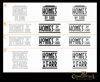
This first pass is always a 2D font picking exercise, with the main looks in both black on white, and white on black to get a general sense of the weight. From this image the craftsman influence came into play as the new direction, so this step , though off base for finish,  helps to pin point that direction.


Upon the direction, I had only one craftsman font installed[ that I owned] so I mocked this up and the direction was right, but we needed a better font.


Mike found a great font and bought it for the project and I developed a few looks and stacking to finalize the process[ a quick one].


 Once I built the 3D Single Point Beveled type for the main logo I did some craftsman gradients as some color tests.


Project Review: 
Logo Designs for Homes by Farr
PART I

Client: Mike Farr Owner Homes by Farr.
Art Direction: Collaboration with Mike and I.
Project Date: Summer 2011.

As a designer, I get the opportunity to help out folks with my design skills, and on certain occasions I get to do this for friends as well. These projects are very different since I know the client, so it is a bit of a change up from the "stranger" type of client who is only a professional contact, and this is 95% of my work.

Today is a posting of PART I, on the Corporate Logo I designed for Mike Farr,owner of, Homes by Farr out of Littleton Colorado, where I grew up. Mike is a fellow woodworker like me [ we both met in wood shop in 9th grade] so for this job, we went with a Craftsman style, a joint love of us both.

Today I cover the original designs in picking the font, as well as the first simple gradient color studys I did for a base direction. 

I plan to post the second part, with final 3D rendered logos used on the business cards and Real Estate Yard signs, as well as the website assets, though you can peek at them here.

Cheers, THOM

read more "Project Review: Logo Design for Homes by Farr: PART I"
Copyright © interior car. All Rights Reserved.
Blogger Template designed by Big Homes.