Showing posts with label DVD Menu. Show all posts

Project Review: Drive Angry 2011: Blue-Ray-3D Animated Menus

 Here is a final frame from the HD animation for the FBI Badge and leather case.


 Because the Drive Angry badge spins we do see the back so this is a full 360 degree model.


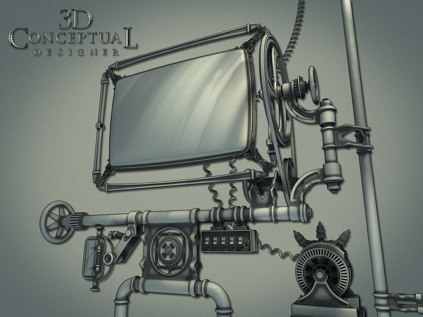
 Here is the Polygon view with mesh smooth ON to see the basic form of the model.


 A "Virtual" necklace worn by Billy Burke as Jonah King in Drive Angry used in the menus.


 Here is the low poly model of the necklace from Drive Angry.


 Here we see it with the mesh-smooth [subdivision added] applied to the above base mesh.


Project Review
Drive Angry 2011 PART I
Blue-Ray-3D Animated Menus

Client: via  Summit Home Entertainment via The Cimarron Group.
Art Director: Brian Larson.
Project Date: February 2011.

About one year ago I did my last job for The Cimarron Group, who were my full time employers for about six years from late 2003 to October 2009. As budgets dropped so did my contributions to Blue Ray Menus, but for Drive Angry, I got the call, and helped render out nearly 500 HD frames of animation for the menus for Brian Larson,with whom I have done a few projects posted here with in the past.

In this PART I posting, I have two main props from the film I recreated in 3D, and I also animated the assets to fly into camera and hit the virtual windshield, our TV screen, as you make your choices in the menu.

In the film there is a Devil Worshiping Cult Leader who is the nemesis of Nick Cage in the film, and I built out his necklace from the film, all Sub-D, as well as the badge for the "Accountant" who is chasing him down from Hell with an FBI badge that magically appears, with his coin toss[ I did that too look for a PART II soon]. William Fichtner does an outstanding job as 'The Accountant', IMO.

Cheers, THOM
read more "Project Review: Drive Angry 2011: Blue-Ray-3D Animated Menus"

Project Review: Black Hawk Down DVD Packaging 3D Illustrations 2002.


 Initial direction had the look of the X-Men Posters I did for them, but it was not a fit for the film, though we were directed to do a pass that felt clean glossy and superhero-ish.


 Here is the 3/4 polygon view showing that I exaggerated the depth for the 3D Illustration as a stylization technique.


 A explode view of the above model shot the various Allen bolts "O-rings" and plates that made up the first pass design.


 Here is the first pass at the military metal with rivets and rust, that was picked.


 Here you can see the three variations I did because I used procedural textures I merely changes a slider or two and hit render again, this is the power you will find in a procedural map on a short deadline like we get in Home Entertainment design projects.


Project Review:
DVD Packaging 3D Illustrations 2002.


Client: Columbia Tri-Star Home Entertainment via BLT and Associates.
Art Director: John Cua.
Project Date:  August 2002.


While I was still in-house at BLT and Associates, one the the larger Theatrical Advertising houses in Los Angeles, I was put on the Home Entertainment divisions packaging for Black Hawk Down due to be released on DVD.I had worked with Matt Rice and his team on a few Key Art projects, but this was an inner sleeve concept we pitched to the client and it did finish.

They wanted to create artwork that would fit behind a clear plastic back-plate that holds the DVD disc, so I did a quick concept that had an X-men feel as directed; Super glossy chrome and brushed metals , but they thankfully changed to a more beat up rusted military look as seen in the film.

To achieve this I used Dark Tree's Simbiont max plug in and did the rust procedural. The main reason was this was to be a three disc set and I wanted each back plate to have a unique look to the rust without having to hand paint the textures[ no time!], and with a procedurals, you can change the 'seed' values and density to achieve 3 fully unique rust looks with a touch of a button and a hit render.

Cheers, THOM
read more "Project Review: Black Hawk Down DVD Packaging 3D Illustrations 2002."

Project Review:DVD Menu Design for The Cimarron Group Home Entertainment Reel 2008

 The first concept 3D design I did was this large single monitor CRT design, here it is rendered in ambient material with a dirt pass to exaggerate the cracks and design elements.

 Here is the textured color pass on the above first draft scene. A bunch of the 3D models they sell on TurboSquid are found in here[ Mic,Generator, etc.]

Here I clumped a bunch of various monitors together that would animate to create this menu. All types of video screens are found here.

Here is the above scene with a few monitors removed for the Blue RAY Menu.


 The final design, though not used was rendered at a full 1080p HD size for the final menus and intro aniamtions.


Project Review
DVD Menu Design for The Cimarron Group
Home Entertainment Division Reel 2008

Client: The Home Entertainment Division of The Cimarron Group.
Creative and Art Direction: George Anderson, and Brian Larson.
Project Date: June 2007- March 2008

While in-house as a 'One Man Army', running my little 3D department, I did a few projects for them, so they tasked me with the DVD Menus for the yearly reels we would send out to solicit business, and to highlight the accomplishments of the various teams.

I had in the past done quite a few DVD menu assets, animated and stills, for the Home Entertainment department, and an occasional 3D logo, so they had me design out theis menu screen with a Stempunk flair to it with a set of animated video monitors, and old TV's that would show off the companys work.

The project dragged out over they next year, and the assets as far as I know were never used, but as all design work is subject to the cutting room floor, that in no way discounts the great learning curve, and quite frankly the FUN I have doing the work.

I love steampunk, I did a lot of Jules Verne inspired designs since I was a kid as I grew up with Disney s 20,000 leagues Under the Sea, and that was the hot item growing up in the 70's for what is now called, "steampunk". Old TV's and all the hardware is fun to assemble along with the cast iron Victorian era-eaque' frames and wheels.

I learned early on, NOT to care if it finishes, enjoy the process the creation you made, as I know that the decision process in almost NEVER based on a good idea or art execution, but the temperment of the cilent that particular hour of the day, or even minute by minute[ just wait a minute they will change their mind again!].

Advertising is all about the clients EGO's, so for the young designers with wild eyes out there it is a wake up call, as to what they say in Design School, and as with all of life, some can deal with this sad truth, and some not.


Cheers, THOM
read more "Project Review:DVD Menu Design for The Cimarron Group Home Entertainment Reel 2008"
Copyright © interior car. All Rights Reserved.
Blogger Template designed by Big Homes.