Showing posts with label Behind the Art. Show all posts

Project Review: S.W.A.T. the Movie 2003-PART III-Tactical Personnel Van

 A straight on back shot of the S.W.A.T. van that I built for the feature film marketing. This was designed around a few comps done by the team of Art Directors on the 'pod' for the project back in 2003 while at BLT and Associates as 3D Designer.


 A Worms Eye angle looking up with the back door on this SWAT van, with the back opened up with a few cast members coming at 'Ya.


 A low angled back view with a bit of 'dutch' on the camera, with the back closed up again.


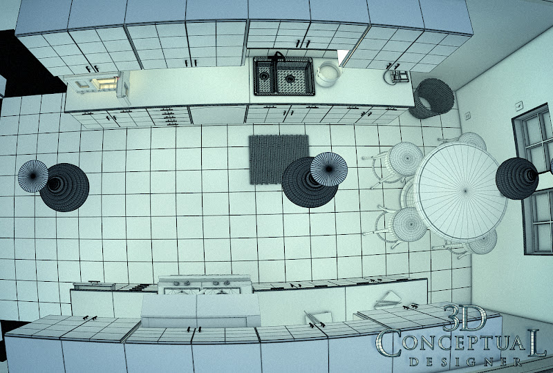
 This overhead shot shows that all details were limited to what was seen in the renders so no front or even side details.


 I went to great detail to be accurate on the door locks and stays that keep the back doors open on these vans so that they would be accurate in style for the iconic vans used by S.W.A.T.


  Here is that back shot in polygons so you can see the level of detail that went into the individual parts on the van.


S.W.A.T. The Movie 2003PART III
The Tactical Personnel Van

Client: Columbia Pictures Inc. via BLT and Associates.
Art Directors: n/a
Project Date: Winter 2002-3.

It this third posting for the work I did for the TV to film adaptation of S.W.A.T., from almost a decade back now. I did this work while I was still an in-house 3D designer at BLT and associates back in 2003. I had done a couple dozen 3D Logos for the film posted here, as well as helping out with the teaser trailer.

In today s blog post we look at the back end of a typical Personnel van used by S.W.A.T. teams in the past, so they wanted an iconic look for the teaser with a van doors.

I built this 3D scene out as all hi-rez, as this was before I perfected my quad modeling techniques over the last decade,  and this was a fast turn around as usual so I did a speed model of the van.

I built out just the back of the van, and a bit of the sides, since we were just creating teaser shots for a few comps using the backside of this van for the posters.

I have a few more posts on S.W.A.T., that I will try and post up these in the future, so keep an eye out.

You can View the logos in PART I here.

You can view the M4 Carbine I built here for PART II

Cheers, THOM
read more "Project Review: S.W.A.T. the Movie 2003-PART III-Tactical Personnel Van"

Behind the Art: The Under Drawings PART II-ScoobyDoo


Here is the under drawing I did for the Scooby Doo Project with Heavy Iron from the 90's for this crypt area of the video game. You can view the final here


One of my favorite sketches for the Scooby Doo game, was this overhead on the above ground graveyard. Here is this final as delivered.


A Secret Laboratory[ final here ] in a rock cave from Scooby Doo the Video Game from the 90's.


The underdrawing I did for this shipwreck cove from Scooby Doo, with the final here.

Behind the Art
The Under Drawings
PART II Scooby Doo

Today I have posted PART II  in this new series of under drawings for various 2D projects.

The under drawing sets the look for the final in a way that is still rough enough to change and add details too, but also clean enough so that my "Non-Artist; clients can easily see the main direction, and enough of my intent to sign off on the next step with the details.

Today I have posed up four examples for the Scooby Doo project I did in the nineties for Heavy Iron Studios here in SoCal, and I posted that work here, if you are interested.

Now, the under drawings are not just a part of the way I create a piece for a client, but also an integral part of the process of approvals I have with them, so I can get sign off for the time consuming final line work stage as well as any thing else before time and $$ is used up on the details, without a clear picture of the overall look and proportions needed for the project.

 I usually put an under drawing over a hand made perspective grid I have made using ship curves, but for these examples, I put a quick grid on the under drawings themselves as seen above.

I do most of these on a 8.5 x 11 piece of generic copy paper, which is abundant and cheap for this. I usually do the final overlay on Clearprint or 'Vincent' Vellum.

You can view PART I of my under drawing posts here.


Cheers, THOM
read more "Behind the Art: The Under Drawings PART II-ScoobyDoo"

Project Review: Drive Angry 2011: Blue-Ray-3D Animated Menus

 Here is a final frame from the HD animation for the FBI Badge and leather case.


 Because the Drive Angry badge spins we do see the back so this is a full 360 degree model.


 Here is the Polygon view with mesh smooth ON to see the basic form of the model.


 A "Virtual" necklace worn by Billy Burke as Jonah King in Drive Angry used in the menus.


 Here is the low poly model of the necklace from Drive Angry.


 Here we see it with the mesh-smooth [subdivision added] applied to the above base mesh.


Project Review
Drive Angry 2011 PART I
Blue-Ray-3D Animated Menus

Client: via  Summit Home Entertainment via The Cimarron Group.
Art Director: Brian Larson.
Project Date: February 2011.

About one year ago I did my last job for The Cimarron Group, who were my full time employers for about six years from late 2003 to October 2009. As budgets dropped so did my contributions to Blue Ray Menus, but for Drive Angry, I got the call, and helped render out nearly 500 HD frames of animation for the menus for Brian Larson,with whom I have done a few projects posted here with in the past.

In this PART I posting, I have two main props from the film I recreated in 3D, and I also animated the assets to fly into camera and hit the virtual windshield, our TV screen, as you make your choices in the menu.

In the film there is a Devil Worshiping Cult Leader who is the nemesis of Nick Cage in the film, and I built out his necklace from the film, all Sub-D, as well as the badge for the "Accountant" who is chasing him down from Hell with an FBI badge that magically appears, with his coin toss[ I did that too look for a PART II soon]. William Fichtner does an outstanding job as 'The Accountant', IMO.

Cheers, THOM
read more "Project Review: Drive Angry 2011: Blue-Ray-3D Animated Menus"

Project Review: Mazda 2-3D Illustration 2009- PART I

 The little Mazda Racer posed with a Flag for the Print Ads for the Launch of the Mazda 2 back in 2010.


 Each render had a layer with a color picker matte[ Smart 3D ] to use to grab individual areas on the image by the Art Director.


 A relaxed pose done for a print ad for the Mazda 2 ad campaign.


 An early pose with the simple reflection we originally used in the face shield.


 Here is a shot of the Mazda Racer winning First Place with Trophy in hand.

Project Review
Mazda 2 3D Illustrations for Print Advertising.
PART I

Client Mazda USA via Rhythm and Hues.
Art Director: Marta Knudsen, and Nick Pugh.
Project Date: Dec 2009- Summer 2010.

This is my first post covering the 3D character Illustration work I did for the Mazda 2 launch done by Rhythm and Hues studios. I have a soft spot for Rhythm and Hues, since my first job after graduation from Art Center was produced by R-n-H, and as it would happen, it too was a Mazda job as this one was.

I was contracted to help with the print advertising work that was to accompany the CGI done in house for the TV spots.

I helped to establish a system of production with my off site studio, and was able to cut the production time for each pose[ about a dozen separate projects], to just over a day of work from a few days each. I recommended that the animators rig the model in a way as that each part was a separate skin so I could re-texture them quickly in my program, since we were on different platforms we did not have a pass over type of file. They use Light wave for TV spots and I am a 3DS max user, so I got FBX exports, and used them for my 3D Illustrations. It cut my cost, but helped my good client meet their need.

All were rendered at about 9000 pixels tall with a 10 passes of render elements, so the shadows, highlights, diffuse, ambient, etc. were all separated on a layer so the key Art Director, Marta Knudsen could easily adjust.

I also provided a matte color picker as these 'SMART 3D" assets make implementation a snap for the in-house Art Directors as all masking is simplified greatly.


Cheers, THOM


read more "Project Review: Mazda 2-3D Illustration 2009- PART I"

Behind the Art: The Under Drawings PART I

 This is an under drawing I did for the Wildstorm Productions GEN 13 Movie from back in the mid 90's as seen here, from this post.

 I had the honor of working on the Raveonettes Music Video "Heart of Stone" here, I did a few production design sketches including the above one here, which won an Academy Award for Art Direction, and so I got a little recognition here.

Here is a partial under-drawing for the wide panoramic curvilinear perspective shot of Main Street here, done for Disney Interactive for the VMK[ Virtual Magic Kingdom] project from back in the 90's as well.

 Inside the big clown head in the middle of the Fantasyland map here, was a circus tent like game. Here is the rough under drawing.
 
 I actually started to flesh out that above view, and scanned it in progress as we see here in this Fantasyland design. This room eventually made it into the final single disc release.


Behind the Art
The Under Drawings
PART I

Today I have posted a series of under drawings for various projects that have been posted here on my design blog over the last few years as a PART I, in a new ongoing series I will do over the next few months.

Under drawing is the practice of doing at least two passes on any design with this first pass drawing used to fully block out a shot, to get basic proportions.

 I usually put an under drawing over a hand made perspective grid I have made using ship curves, but for some the grid is on the under drawing itself as well.

The first great advantage to this method of sketching allows you to be able to make bold design choices at the sketch time, since the piece you are on is NOT the final, so you are a bit more free on this stage. 

I also tend to scan and send out this stage to a client who is strapped for cash[ everyone now!], to give them a better idea of what I am planning on doing next. 

The last advantage is that the under drawing takes a short time, about 1/10th the final line and shading stage, so if you want to make any changes, the time to do this is when it is blocked out in the under drawing, BEFORE the time and cash have been spent on a possible differing camera view, or design choice.

Cheers, THOM
read more "Behind the Art: The Under Drawings PART I"

Project Review: Laptop PC- Stock 3D Model 2007

 Here is the main shot of the generic laptop in a gun-metal plastic case.


 A close up detailing the stickers and USB  ports on the side along with the Blue-Ray DVD drive.


 A few lower resolution[ 960 x 540 DVD menu] renders of the Laptop model I designed and built out.


 A Polygon Mesh view showing the details built out in this laptop model.


 A close up of the USB port side of the laptop detailing the start button, speaker grills etc.


Project Review
Laptop PC- Stock 3D Model 2008


Client: The Cimarron Group.
Art Director: Myself.
Project Date: Summer 2007

While I ran the little 3D department of one, at The Cimarron Group, I built up a library of 3D assets for a variety of jobs that had come in, but I also anticipated what I might need, and more than once, I needed a generic laptop, so I built one out quickly for a few presentations.

I used in for Neurocomp Systems for the EEG meter design they used a typical laptop on the cart so I had this available for that render. I also used it for the WB Live website renders, to illustrate how to transfer data from an iPhone to a Laptop, though they ended up buying a Mac model instead. I also used it for some blue Ray menus for Sex Drive, for the Home Entertainment department as well. 

The model was built very quickly, as I was in between projects and fit it in. I rendered it in various materials for the differing jobs but it worked out well animated with the lid, as well as the lights etc. I plan a full quad version that I will re-design and sell in the future.

Having had 3 years of product design at Art Center certainly helps to get a quick generic product design that emulates what you would find in a real store, but still be generic enough not to stand out as a specific model of a Mac or Dell etc.

Virtual stock photography has the advantage, in that the corporate logos need not be covered up on a Laptop like this, you simple leave them off or make one up. 

This also saves money, in that you can buy the image outright without any added usage fees for added applications that a stock photo usually has go along with its use.

Cheers, THOM
read more "Project Review: Laptop PC- Stock 3D Model 2007"

Personal Project: Kitchen Rendering Design Tests 2008

 Here is the quad view top-sown shot with a bit of fish-eye on the lens to show the thin little space I designed out for this test.

 The same quad[ polygon view] view looking from the camera.


 My night lighting shot had blue lights outside that bledd the tone into the room with the warm glow from the counter top toaster-oven.


 My late afternoon shot had medium lighting


 My brightest noon shot with lots of orange bounce light added into the shot.


Personal Project:
Kitchen Rendering Design Tests 2008

While I was in-house at The Cimarron Group back in 2008, I had some down time , and I used this to practice my 3D skills to be a better artist, and I often took any opportunity given to me, to learn more in 3D and to practice, practice, practice!

I was doing Architectural tests at that point, as I had plenty of 3D logos to show off, so I wanted to fill in the Architectural Pre-Viz section of my work for Cimarron, with some additions to help sell this part of our company skills offered, so I designed a kitchen scene to test out a few things.

I used appliances that I had built out for the Poseidon re-make's website virtual tour, and I grabbed those assets to fill in the design. I went for a cross design mix, between a clean European Modern look, with an Asian flair in the color texture and details. 

I designed, built and added in the sink bamboo mat, and matching trashcan, some Sushi blocks and chop-sticks, as well as a Sumi painting on the wall, all lit with the round lantern type of lights mimicking the paper lanterns, though done up in a nice ribbed glass. 

I used this time, to test speed in the GI engine I was using[ Final Render of course!], and I did night, mid-day, and an afternoon sun version of the space to see what the minimum settings that could be used, and still get an acceptable output would take on this 'generic' set. 

A HUGE part of the design process in advertising is rendertime. Those lacking experience forget to factor this in, and you could end up with a three day render for a project due by days end, so tests like these help me more accurately get a time frame for my clients, which is usually the first thing asked is how long will it take[ or how much $$$].


Cheers, THOM
read more "Personal Project: Kitchen Rendering Design Tests 2008"

Project Review: 21: Blue-Ray and DVD Menus-3D Animation + Illustrations

 A frame from the final HD Animation I did for the Blue-Ray DVD menus for Art Director Hesham Morsy at The Cimarron Group back in 08'


 Here is a 'Hero' shot of the Virtual Blackjack table I built for the project


 A Player POV[ Point of View] shot for a menu. I was ready to animate cards etc.


 The overhead move down to the table felt is seen here in the opening frame of a proposed Style Frame.


 A Dealer POV shot for the Blackjack game done for the presentation for, 21 the film back in 2008.


 Here is a shot if the blackjack table built fast and dirty with only the padded rail done in quads.

Project Review
21
Blue-Ray DVD Menus

Client: via The Cimarron Group.
Art Director: Hesham Morsy.
Project Date: April 2008.

Back in the fall of 2008, I was still in-house at The Cimarron group, and got to work with Hesham Morsy, on the Blue-Ray DVD menus with him as I did on, "So I Married an Axe Murderer" the prior year. I have worked on a a couple dozen projects with the AE[ After Effects] team on Home Entertainment over the years, always a pleasure.

For this project, I provided two parts; First a 3D animation sequence in HD of flying poker chips, cards, and Playing Card Icons of Hearts, Clubs, Diamonds, and Spades, and Second a Blackjack table interface for the menu itself.

I built out a fast and quick model of the Blackjack table game, as the budget was smaller, as they had been each year so 3D got squeezed out of production over time, but it was sure FUN while it lasted. I reused some stools from the Felini's Model I built for the owner of Cimarron, and the chip was a reuse as well, but the piece was scrapped, though the 3D animation transition I did, was rendered and put in the final.


Cheers, THOM
read more "Project Review: 21: Blue-Ray and DVD Menus-3D Animation + Illustrations"

Project Review: Virtual Magic Kingdom PART VI-Curvilinear Perspective Wraps

 Here is the full 360 wrap for the Adventureland hub, near the Jungle Cruise for the Video Game we were developing back in the 90's at Disney Interactive.


I printed this out on the color xerox and made a cylinder that you could stand-up and view to get the feel for the space in 3D[ it worked great!], a 2D version of Quicktime VR from the era in sketch format!  Here is a 3D Mock-Up to Illustrate this technique


A close up on the RIGHT side of the wrap with the Pavilion in center.


A close Up of the LEFT side of the wrap with the Queue for the Jungle Cruise.


Disney Interactive: VMK
Virtual Magic Kingdom DVD Game
Curvilinear Perspective Wraps

 Part VI

Client: Disney Interactive
Art Director: Myself
Project Date: Summer 1996

This is my sixth post in my series on the Virtual Magic Kingdom [ VMK] project I did for Disney Interactive back in 1996, and with this post, I cover a second perspective wrap that I did for a full 360 view from one of the game "Nodes".

They wanted a single sketch that would help them visualize the view from a specific point in the hub at the Virtual Disneyland Park we were making for the Virtual Magic Kingdom game so I did a sketch for each land.

You will notice that the artwork uses the fish-eye perspective grids I based on M.C. Eschers study of this drawing method, so I developed it to the project. I even taught the team curvilinear perspective to follow the theme we had for this game. A very fun time I had there with a great team, and now that I am back doing work for WDI, I pass by the old building on a regular basis.

You may review my earlier VMK posts in these link-a-dinks:

PART I
PART II
PART III
PART IV
PART V

Cheers, THOM
read more "Project Review: Virtual Magic Kingdom PART VI-Curvilinear Perspective Wraps"

Project Review: Twilight Logos PART IV: 3D Logos for Eclipse, the third film

Round 1 was almost final for Twilight Eclipse, I just adjusted the texture mapping a bit and we were done.


Here is the final 3D Logo I did for Eclipse the third film in the Twilight series back in 2009.


Here is a quad poly view showing the scene layout with the 3D welds re-sued for each film.


This is a combo Ambient render and screen capture showing the lighting set-up for the aura around the full moon eclipse.


The texture map breakdown shows the procedural base material with the supplied texture map from the Art Director, Joseph Stamper.


Twilight Logos PART IV
TWILIGHT ECLIPSE PART III
3D Logos and Illustrations for Print Advertising

Client: Summit entertainment via The Cimarron Group.
Art Directors(s): Calvin Sumler, Joseph Stamper, and Chris A. Hawkins.
Project Date: Winter 2010.

I had the great privilege of working on all four Twilight ad campaigns, and today I post the work I did for the finished 3D Logo for the third film Eclipse done back in 2009, A bit out of order as I have posted the others already here so you can search using the Google toolbar up top on the LEFT..

Early in the series I had the room to experiment more with the look and feel of the logo, and we did a whole lot more variation and 3D sculpting, but as we moved forward they wanted a simple extruded logo so that is what I did.

On this third film in the series, I only did two versions of the logo for Joseph, and the only change was the scale of the texture map used, was made ultra small for a fine detailed look. The main 'gag" so to speak was the full eclipse of the "dot" in the letter I. I back lit the 3D scene with 3 different volumetric lights to get the aura feel correct around the moon. I also combines a Procedural texture and photographic color to achieve the look needed for this third round.

You can view PART I for the first film here.

You can view PART II for New Moon here.

You can view my 3rd post for Breaking Dawn HERE.


Cheers, THOM
read more "Project Review: Twilight Logos PART IV: 3D Logos for Eclipse, the third film"
Copyright © interior car. All Rights Reserved.
Blogger Template designed by Big Homes.