Showing posts with label Conceptual Designs. Show all posts

Behind the Art: The Under Drawings PART II-ScoobyDoo


Here is the under drawing I did for the Scooby Doo Project with Heavy Iron from the 90's for this crypt area of the video game. You can view the final here


One of my favorite sketches for the Scooby Doo game, was this overhead on the above ground graveyard. Here is this final as delivered.


A Secret Laboratory[ final here ] in a rock cave from Scooby Doo the Video Game from the 90's.


The underdrawing I did for this shipwreck cove from Scooby Doo, with the final here.

Behind the Art
The Under Drawings
PART II Scooby Doo

Today I have posted PART II  in this new series of under drawings for various 2D projects.

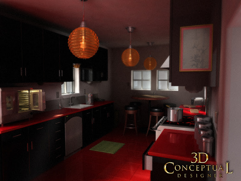
The under drawing sets the look for the final in a way that is still rough enough to change and add details too, but also clean enough so that my "Non-Artist; clients can easily see the main direction, and enough of my intent to sign off on the next step with the details.

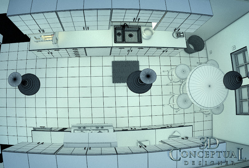
Today I have posed up four examples for the Scooby Doo project I did in the nineties for Heavy Iron Studios here in SoCal, and I posted that work here, if you are interested.

Now, the under drawings are not just a part of the way I create a piece for a client, but also an integral part of the process of approvals I have with them, so I can get sign off for the time consuming final line work stage as well as any thing else before time and $$ is used up on the details, without a clear picture of the overall look and proportions needed for the project.

 I usually put an under drawing over a hand made perspective grid I have made using ship curves, but for these examples, I put a quick grid on the under drawings themselves as seen above.

I do most of these on a 8.5 x 11 piece of generic copy paper, which is abundant and cheap for this. I usually do the final overlay on Clearprint or 'Vincent' Vellum.

You can view PART I of my under drawing posts here.


Cheers, THOM
read more "Behind the Art: The Under Drawings PART II-ScoobyDoo"

Project Review: X-Men 2: PART III-3D Logos from a Single Vector


 A double plate 3D Logo design I did for X-Men 2, with some mild pitting in the scratched steel face.


 A glass plate with a heavy bevel and a thin metal plate on top for this X-Men 2 Log I did back a decade ago.


 The top X-Men 3D Logo objects have a heavy thick bevel and the holding device has about half as much. Sitting on a gloss black surface.


 Here I did a hollow face logo for X-Men, with a very big bevel in a warm environment for lighting.


 Here is a deep extrusion coming up from infinity to reveal the above logo with a much deeper holding post.


 A solid two plate design with the X objects pulled out from a bit in 3D space for this X-Men 3D Logo.


 For this alternate I revered the type move and put the "2" out front, I also then cut out the insides to make a deep pocket in there for heavy shadows on a simple x, and a 2.


Project Review
X-Men 2: PART III
3D Logo Designs from a Single Vector File


Client: 20th Century Fox Via BLT and Associates.
Art Director: Zack Ris
Date: Spring 2001

I had well over 200 logos I did for X-Men 2 from a decade back now, when I was an in-house 3D  Designer over at BLT and Associates, and today I have details on one sub-set all based on a single Vector file.

Part of what was great over at BLT, was that an Art Director would give me a single vector file designed in 2D, and also give me plenty of design space to create a dozen solves, not just one. 

Since I am versed in 3D design space,and most importantly, I was taught to think in three dimensions via my Industrial Design Degree from A.C.C.D., I always see a flat vector in multiple solves at delivery in 3D. I usually drop a few suggestions to an Art Director, but typically I do just one design for each logo, but here on X-Men 2, I had time to do about twelve per vector file.

I will be posting a few more solves from other vectors in the future for this X-Men 2 series I have here on my design blog.

You can view PART I here and PART II here, or you can search the blog using X-Men to see my X-Men 3, and First Class stuff as well.


Cheers, THOM
read more "Project Review: X-Men 2: PART III-3D Logos from a Single Vector"

Project Review: Virtual Magic Kingdom PART VII-Curvilinear Perspective Wrap-Frontierland


 Here is a scan of the clean Curvilinear Perspective Grid I made from North , East, South, and West vanishing points for these wraps.


 Here is the 38" wide Frontierland full HUB sketch I did back in the mid nineties.


 Here I overlay the grid over my sketch so you can see how I followed the base grid  for my drawing.


 Here is a close-up shot of the far LEFT of the sketch looking to the gate.


 The middle of the  wide sketch with the various old buildings.


 A close Up of the RIGHT side of the wrap with the Haunted Mansion there at the end on the hill.


Project Review: 
Virtual Magic Kingdom Video Game PART VII
Frontierland Curvilinear Perspective Sketches


Client: Disney Interactive
Art Director: Myself
Project Date: Summer 1996

This is my seventh post in my series on the Virtual Magic Kingdom [ VMK] project I did for Disney Interactive back in 1996, and with this post, I cover  third HUB perspective wrap that I , and this time I worked on a old muddy, rutted road with the town of Frontierland smack in the middle. You can view the rest of Frontierland here.

We put the Haunted Mansion on on end of the town, and the big Gate on the other that leads back to the HUB. You can also see this in my large overhead sketch here. A fun exercise to develop the overall look and be able to see it in 360 degrees as well.


I have taught fish-eye perspective using grids for years, it certainly helps you visualize a real dimensional space, as this sketch was then built out in 3D for the game in Alias Wavefront[ Pre-Maya days] by the talented 3D team.


You may review my earlier VMK posts in these link-a-dinks:

PART I
PART II
PART III
PART IV
PART V
PART VI

Cheers, THOM
read more "Project Review: Virtual Magic Kingdom PART VII-Curvilinear Perspective Wrap-Frontierland"

Personal Project: Kitchen Rendering Design Tests 2008

 Here is the quad view top-sown shot with a bit of fish-eye on the lens to show the thin little space I designed out for this test.

 The same quad[ polygon view] view looking from the camera.


 My night lighting shot had blue lights outside that bledd the tone into the room with the warm glow from the counter top toaster-oven.


 My late afternoon shot had medium lighting


 My brightest noon shot with lots of orange bounce light added into the shot.


Personal Project:
Kitchen Rendering Design Tests 2008

While I was in-house at The Cimarron Group back in 2008, I had some down time , and I used this to practice my 3D skills to be a better artist, and I often took any opportunity given to me, to learn more in 3D and to practice, practice, practice!

I was doing Architectural tests at that point, as I had plenty of 3D logos to show off, so I wanted to fill in the Architectural Pre-Viz section of my work for Cimarron, with some additions to help sell this part of our company skills offered, so I designed a kitchen scene to test out a few things.

I used appliances that I had built out for the Poseidon re-make's website virtual tour, and I grabbed those assets to fill in the design. I went for a cross design mix, between a clean European Modern look, with an Asian flair in the color texture and details. 

I designed, built and added in the sink bamboo mat, and matching trashcan, some Sushi blocks and chop-sticks, as well as a Sumi painting on the wall, all lit with the round lantern type of lights mimicking the paper lanterns, though done up in a nice ribbed glass. 

I used this time, to test speed in the GI engine I was using[ Final Render of course!], and I did night, mid-day, and an afternoon sun version of the space to see what the minimum settings that could be used, and still get an acceptable output would take on this 'generic' set. 

A HUGE part of the design process in advertising is rendertime. Those lacking experience forget to factor this in, and you could end up with a three day render for a project due by days end, so tests like these help me more accurately get a time frame for my clients, which is usually the first thing asked is how long will it take[ or how much $$$].


Cheers, THOM
read more "Personal Project: Kitchen Rendering Design Tests 2008"

Project Review: X-Men 2: Part II-Cerebro Door Icon Designs


A Cerebro Door Icon I designed that had a metal brushed front plate, with blue glass sandwiched in between, with some fasteners l holding it all together.
 
By far my personal favorite for the Cerebro Doors I did for X-men two, was this example, with a cast iron double base plate, and a machined top face.


I took the top brushed face and first level of casting from my 'fave up there', and created a "spherical" LOGO that would spin up for the AV and web usage[ my first intro into Motion Graphics]

Metal face with blue glass within with a floating negative space reading "X". A fun solve for X-men that ended up looking alot like what was finished for Fantastic 4 a few years past[ by another artist].

I had this one with 'pachinko' pinball balancing the four parts forming the X for X-men 2 Cerebro Doors that I designed.


 An X door on a rock wall split into tow doors, with the lighting taken from the first films finished look at BLT


Project Review
X-Men 2: PART II
Cerebro Door Icon Designs


Client: 20th Century Fox Via BLT and Associates.
Art Director: Zack Ris
Date: Spring 2001

I had well over 200 logos I did for X-Men 2 from a decade back now, when I was an in-house 3D  Designer over at BLT and Associates, so today I have gathered up a set of my favorite Cerebro Door Icons that I did for the project to foucs on them in a better scale to view.

I love doing big metal superhero logos , and this part of the project was a blast to come up with some looks. I had a basic brushed metal look, established in the first film that I used as my spring-board, so I did some direct replicas in 3D, since the first film uses a 2D illustration for the big X, since it is not a real 3D asset.

I had a great amount of design room given to me on this[ BLT's strength!], to come up with some heavy metal, and iron looks for these icons. I did cast metal, brushed metals, lots of blue glass[ that eventually went to Fantastic 4]. A fun process and end product.

You can view PART I here or search the blog using X-Men to see my X-Men 3, and First Class stuff as well.


Cheers, THOM
read more "Project Review: X-Men 2: Part II-Cerebro Door Icon Designs"

Project Review: Virtual Magic Kingdom PART VI-Curvilinear Perspective Wraps

 Here is the full 360 wrap for the Adventureland hub, near the Jungle Cruise for the Video Game we were developing back in the 90's at Disney Interactive.


I printed this out on the color xerox and made a cylinder that you could stand-up and view to get the feel for the space in 3D[ it worked great!], a 2D version of Quicktime VR from the era in sketch format!  Here is a 3D Mock-Up to Illustrate this technique


A close up on the RIGHT side of the wrap with the Pavilion in center.


A close Up of the LEFT side of the wrap with the Queue for the Jungle Cruise.


Disney Interactive: VMK
Virtual Magic Kingdom DVD Game
Curvilinear Perspective Wraps

 Part VI

Client: Disney Interactive
Art Director: Myself
Project Date: Summer 1996

This is my sixth post in my series on the Virtual Magic Kingdom [ VMK] project I did for Disney Interactive back in 1996, and with this post, I cover a second perspective wrap that I did for a full 360 view from one of the game "Nodes".

They wanted a single sketch that would help them visualize the view from a specific point in the hub at the Virtual Disneyland Park we were making for the Virtual Magic Kingdom game so I did a sketch for each land.

You will notice that the artwork uses the fish-eye perspective grids I based on M.C. Eschers study of this drawing method, so I developed it to the project. I even taught the team curvilinear perspective to follow the theme we had for this game. A very fun time I had there with a great team, and now that I am back doing work for WDI, I pass by the old building on a regular basis.

You may review my earlier VMK posts in these link-a-dinks:

PART I
PART II
PART III
PART IV
PART V

Cheers, THOM
read more "Project Review: Virtual Magic Kingdom PART VI-Curvilinear Perspective Wraps"

Project Review: The Phantom 2040-PART 95: LXXXXV- Small Stuff Props

 A Coffee Pot I designed for The Phantom 2040, used in the Dorms and also re-used with the Maid B.I.O.T. here.

 A small compass, not sure who used this one it was unmarked, but it was a Phantom prop for sure.


 The Phantom used this cable rider for a few episodes, and it was a pick-up prop requested by the animators in Canada for the project I did this on-site while I was there visiting the vendor in 1991.


 Here is a small old styled pocket watch used by Graft when it was the flashback sequence.


Phantom 2040-PART LXXXXV[95th]
Small Stuff Prop Design Drawings

Client: Hearst Animation Productions.
Art Director: Myself.
Project Date Spring 1993.


This is my 95th post for The Phantom 2040 from in the early ninety's, and today I have posted a few small props that I did for the show as a quick post.

When you do a futuristic setting everything see needs to be addressed in design. Characters and the overall world come first, but this world then needs to be filled in.

I had to design anything seen, or especially touched, used or referenced by and character in the story, but I also needed to fill up areas so I designed literally hundreds of these little bad boys to fill the world of METROPIA!

Are you a FAN of The Phantom 2040, and on FACEBOOK, there is a group  here.

There is a TAG on the list to the RIGHT for other Phantom 2o4o entry's, but you can click this as well.

Cheers, THOM
read more "Project Review: The Phantom 2040-PART 95: LXXXXV- Small Stuff Props"

Project Review: Launch City PART VIII[ 8th]-The Target Jukebox Design 1999.

Here is the original final shot for Launch CD-zine Issue #40 from 1999 @ 640 x 480 the size limit at the time fro shockwave to run smoothly.


I did a quick open and re-render at a higher rez to show some details[missing a few maps though after 14 years...]


Here is the main screen shot in geometry showing the model details I added in.


The set was a two wall configuration and I built a little conduit with the parked gum pushed up in the crack.


Here is a shot of the full to the floor jukebox as geometry for Launch.com

 Launch City Part VIII
The Target Jukebox design for Issue #40

Client: Launch Media Inc.
Art Director: Myself
Project Date: 1999

In this 8th post on LAUNCH city, I am posting work done on a jukebox built out for a Target sponsored space with a fully animated 3D jukebox.

This was one of my very first projects I worked on when I joined the three man team as Art Director in 1999. I love to model in 3D, and that seems to be something that many people do not like. 
 
To me the fun part is the build itself. I love the process of construction. This may be due to the fact that I am an avid woodworker, copper smith, and I love to sculpt and create, so naturally I would love virtual building too.
 
I made the model close to, but not exact to a famous iconic Juke box from the 50's for the project, and I passed it over to Cayce Justus and he skillfully rigged it up and animated the arm and curtains inside for me.
As a point in 3D history this is the project where I made a material editor breakthrough in 3DSmax with Chrome and Glass and applied it here in the default scan-line rendered. 
 
Remember this was 14 years back, pre GI and all the good render tools we know see as commonplace were not out yet, so lots of ambient lights to simulate bounce etc.

Cheers, THOM

To view PART I on Launch City you can go here.

To view PART II go here.

To view PART III for the Train Station "Twitch" look here.

To view PART-IV look here.

To view PART V- you can click here.

To view PART VI [ the sub!] go here. 

To view PART VII-The Vault, go here.


read more "Project Review: Launch City PART VIII[ 8th]-The Target Jukebox Design 1999."

Project Review: Mean Girls 2004: Motion Graphics 3D Logo design

 Round one had clean simple type done in diamonds and platinum for Mean Girls in 2004.

 A shot of the bracelet on black with the satin removed as an alternate for the MGFX design.

 This is the final that finished at 4K for the International Trailers.

 Here is a shot of the final image in quads showing the build.

 A low angle shows off how much I moved the letters around to fit the pink cloth final finished logo for Mean Girls.

  Here is a shot of the quad model showing. the welds I built into the chain links using the nPower tools.

Project Review
Mean Girls 2004: Motion Graphics 3D Logo design


Client: Paramount Pictures via The Cimarron Group.
Art Direction: Michelle Jackino and Erik Counter.
Project Date: Spring 2004.

My very first early Motion Graphics piece from my days at The Cimarron Group from 2003-2009, was done while Michelle Jackino ran the AV division, and I had the pleasure to work with the in-house Predator Erik Counter on Mean Girls.

Mean Girls needed a charm bracelet, fully built as the 3D logo for the piece, so I proceeded to begin my design in 3D. I started very straight and flat, but later on was directed to  really move the letters around so we put it on some pink cloth and I modeled it to conform to the shapes. It ended up finishing for the International Trailers.


Cheers, THOM
read more "Project Review: Mean Girls 2004: Motion Graphics 3D Logo design"

Personal Project Napkin Sketching and Doodles Part XIX[19th]

 I added more stories to the quick doodle design I did here.[ I will keep adding height!]

These three little characters I designed are trouble!

A sad dark robot a bit depressed and worried.


I did this little snowman head right after the holiday season.

Personal Project
Napkin Sketching and Doodles Part XIX[19th]
 
 In this nineteenth installment of the Napkin Sketches, Drawings, and Doodles I do when I have a pen or pencil in hand, I have put up some more.

These doodles are quick ideas as well, usually 3-5 minute sketches as a speed challenge. I also often repeat and re-do concepts to refine them a bit like seen above. It is just like I do on a paid project, only it is spread out over days rather than doing twenty or so sketches of little robots in one afternoon, I do one a night for a week, with each one taking queues' from the last.

Today I have put up a 5 story version on the mini swamp house I have done before, only this round it is even taller. I will keep going to ridiculous then stop!

I also have a bunch of characters including the "Manny, Moe, and Jack-esque' three friend grouping. Each is very different from the other, but they are a matched set.

You can view the other parts as follows:
PART I
PART II
PART III
PART IV
PART V
PART VI
PART VII
PART VIII
PART IX 
read more "Personal Project Napkin Sketching and Doodles Part XIX[19th]"
Copyright © interior car. All Rights Reserved.
Blogger Template designed by Big Homes.