Showing posts with label Architecture.. Show all posts

Behind the Art: The Under Drawings PART I

 This is an under drawing I did for the Wildstorm Productions GEN 13 Movie from back in the mid 90's as seen here, from this post.

 I had the honor of working on the Raveonettes Music Video "Heart of Stone" here, I did a few production design sketches including the above one here, which won an Academy Award for Art Direction, and so I got a little recognition here.

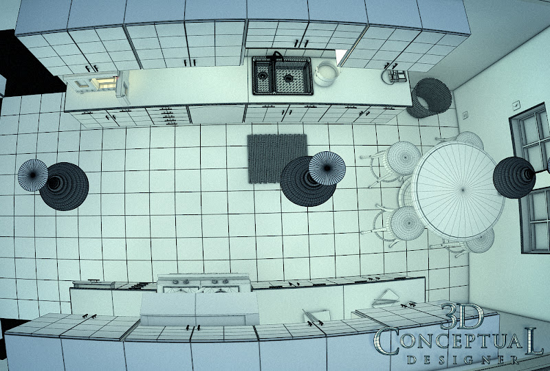
Here is a partial under-drawing for the wide panoramic curvilinear perspective shot of Main Street here, done for Disney Interactive for the VMK[ Virtual Magic Kingdom] project from back in the 90's as well.

 Inside the big clown head in the middle of the Fantasyland map here, was a circus tent like game. Here is the rough under drawing.
 
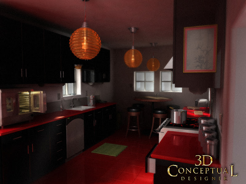
 I actually started to flesh out that above view, and scanned it in progress as we see here in this Fantasyland design. This room eventually made it into the final single disc release.


Behind the Art
The Under Drawings
PART I

Today I have posted a series of under drawings for various projects that have been posted here on my design blog over the last few years as a PART I, in a new ongoing series I will do over the next few months.

Under drawing is the practice of doing at least two passes on any design with this first pass drawing used to fully block out a shot, to get basic proportions.

 I usually put an under drawing over a hand made perspective grid I have made using ship curves, but for some the grid is on the under drawing itself as well.

The first great advantage to this method of sketching allows you to be able to make bold design choices at the sketch time, since the piece you are on is NOT the final, so you are a bit more free on this stage. 

I also tend to scan and send out this stage to a client who is strapped for cash[ everyone now!], to give them a better idea of what I am planning on doing next. 

The last advantage is that the under drawing takes a short time, about 1/10th the final line and shading stage, so if you want to make any changes, the time to do this is when it is blocked out in the under drawing, BEFORE the time and cash have been spent on a possible differing camera view, or design choice.

Cheers, THOM
read more "Behind the Art: The Under Drawings PART I"

Personal Project: Kitchen Rendering Design Tests 2008

 Here is the quad view top-sown shot with a bit of fish-eye on the lens to show the thin little space I designed out for this test.

 The same quad[ polygon view] view looking from the camera.


 My night lighting shot had blue lights outside that bledd the tone into the room with the warm glow from the counter top toaster-oven.


 My late afternoon shot had medium lighting


 My brightest noon shot with lots of orange bounce light added into the shot.


Personal Project:
Kitchen Rendering Design Tests 2008

While I was in-house at The Cimarron Group back in 2008, I had some down time , and I used this to practice my 3D skills to be a better artist, and I often took any opportunity given to me, to learn more in 3D and to practice, practice, practice!

I was doing Architectural tests at that point, as I had plenty of 3D logos to show off, so I wanted to fill in the Architectural Pre-Viz section of my work for Cimarron, with some additions to help sell this part of our company skills offered, so I designed a kitchen scene to test out a few things.

I used appliances that I had built out for the Poseidon re-make's website virtual tour, and I grabbed those assets to fill in the design. I went for a cross design mix, between a clean European Modern look, with an Asian flair in the color texture and details. 

I designed, built and added in the sink bamboo mat, and matching trashcan, some Sushi blocks and chop-sticks, as well as a Sumi painting on the wall, all lit with the round lantern type of lights mimicking the paper lanterns, though done up in a nice ribbed glass. 

I used this time, to test speed in the GI engine I was using[ Final Render of course!], and I did night, mid-day, and an afternoon sun version of the space to see what the minimum settings that could be used, and still get an acceptable output would take on this 'generic' set. 

A HUGE part of the design process in advertising is rendertime. Those lacking experience forget to factor this in, and you could end up with a three day render for a project due by days end, so tests like these help me more accurately get a time frame for my clients, which is usually the first thing asked is how long will it take[ or how much $$$].


Cheers, THOM
read more "Personal Project: Kitchen Rendering Design Tests 2008"

Personal Project Napkin Sketching and Doodles Part XIX[19th]

 I added more stories to the quick doodle design I did here.[ I will keep adding height!]

These three little characters I designed are trouble!

A sad dark robot a bit depressed and worried.


I did this little snowman head right after the holiday season.

Personal Project
Napkin Sketching and Doodles Part XIX[19th]
 
 In this nineteenth installment of the Napkin Sketches, Drawings, and Doodles I do when I have a pen or pencil in hand, I have put up some more.

These doodles are quick ideas as well, usually 3-5 minute sketches as a speed challenge. I also often repeat and re-do concepts to refine them a bit like seen above. It is just like I do on a paid project, only it is spread out over days rather than doing twenty or so sketches of little robots in one afternoon, I do one a night for a week, with each one taking queues' from the last.

Today I have put up a 5 story version on the mini swamp house I have done before, only this round it is even taller. I will keep going to ridiculous then stop!

I also have a bunch of characters including the "Manny, Moe, and Jack-esque' three friend grouping. Each is very different from the other, but they are a matched set.

You can view the other parts as follows:
PART I
PART II
PART III
PART IV
PART V
PART VI
PART VII
PART VIII
PART IX 
read more "Personal Project Napkin Sketching and Doodles Part XIX[19th]"

Personal Project: Napkin Sketching and Doodles Part XVIII-[18th]

 I've been on these little cabins and swamp houses lately, so I did the super high,  tall and thin proportioned concept last night. I tilted each level of the house to the emulate the back and fourth found in the human torso body mass and hips, this gave the home some 'life'. A pain to take up the groceries huh!


 As my Eastern European friend would say, a little "willage"[village]. This was to be the background behind the above sketch if I do this in 3D.


 Another mini [ 1" tall] robot sketch. I try to capture a felling in each little sketch I do. The goal is to get a personality with the least amount of work first. Details can always be added to any design, but the base comp must work.


I was explaining 'gelatinous' to my 6 year old referring to the character "Bob' in Monsters vs. Aliens, so later than night, I did a gelatinous armless puppy with a ball as seen here, ...yea I know...

Personal Project
Napkin Sketching and Doodles Part XVIII[18th]
 
 In this eighteenth installment of the Napkin Sketches, Drawings, and Doodles I do when I have a pen in hand, I have put up some more 2012 sketches that I have done this month.

These doodles are quick ideas usually 5-10 minutes from concept to final. I learned at A.C.C.D. in Viss-Com 7, my senior year to do these quick 2 minute, 3 minute and 5 minute sketch drills.

We would do these in Doug Halberts 7th term class for hours on end, and little did I know how valuable the exercise would be.

Don't get me wrong, I love a good full day detailed blue line sketch as evidenced on my blog here, but these little ones are so valuable to do FAST, it really sharpens your ability to make a fast design choice.

Keep on doodlin'!

You can view the other parts as follows:
PART I
PART II
PART III
PART IV
PART V
PART VI
PART VII
PART VIII
PART IX 
PART XVI
PART XVII

Cheers, THOM
read more "Personal Project: Napkin Sketching and Doodles Part XVIII-[18th]"

Project Review: Launch City-PART VII- Destination:The Vault.

 
 This is still one of my top Images I made for Launch.com back in 1999.


 This was pre-quad modeling form me a decade+ back so here are the wire files...


Here is the establishing shot seen first in Issue #40 of Launch.com, this is the main lower area with a gift-shop in center.


Here is the close up move if you clicked on the center of the image for the shop.


This is the interior of the shop that was filled with advertising for this virtual online city.


At the base of the main staircase, there was a phone booth that we used for a few interviews.


 A corner set up for a multi person interview.


 Used in Issue #42, an interview area with two band members was green screened into this space for the CDzine'.


 The same corner seen above from a different angle, and this illustrates the power of a virtual set, just pick a good angle and shoot!


Launch City Part VI
The Vault

Client: Launch Media Inc.
Art Director: Myself
Project Date: 1999

In this seventh post on LAUNCH city, I am posting work done on the destination called, The Vault. I was hired by my fellow ACCD alumni Goutam Mitra as an ex-imagineer to theme the entire city out for them, and with this space, I had a whole bunch of fun.

I originally handed the space off to fellow ACCD team member John Wee, as a blocked out shell of a building to flesh out, but I ended up going back to it myself after a few weeks.  I completely reworked the space, and finished it out as seen above myself.

Each space in Launch City, had a distinct architectural visual theme, so that the furniture, architecture, and even the fonts would be representative of the space so the viewers would "map' their locations visually back to the space.

Also each space had a minimum of 4-6 locations set up and ready to go for the virtual interviews and performances done for each months CD-zine and online shock wave alternative.

The vault theme, is what is called "The Chicago Style" as practiced by Louis Sullivan, so I used some themes I saw in his work to create this space. Also from the era of the 20's in general, so I used the chairs from the LA train station to fit them into the space as well.

Cheers, THOM

To view PART I on Launch City you can go here.

To view PART II go here.

To view PART III for the Train Station "Twitch" look here.

To view PART-IV look here.

To view PART V- you can click here.

To view PART VI [ the sub!] go here.


read more "Project Review: Launch City-PART VII- Destination:The Vault."

Project Review: The Woman In Black 2011

 The Mansion from The Woman in Black, as built from the scrap from the film as my first delivered 3D render.
 

 I squished the geometry and flattened the courtyard back for this worms eye shot.


 A close up on the front steps. In this comp the foreground was filled with a shot of Daniel Radcliffe looking up at THAT window, like in the trailers...


 Here is a re purposed wall turned into the interior for a fast comp idea.


  Here is a bird's eye shot showing the whole model built. I did not detail the sides we would not see for now, but in 3D it is a quick copy and paste to add that in.


 Here is a quad view close up showing the window and gutter model detailing that went into this comp piece.

 
Project Review:
The Woman in Black Key Art 3D Illustration

Client: CBS Films via Cold Open 
Art Direction:Gardner DeFranceaux
Project Date: Fall 2011.
I have done 3D illustration work on a freelance basis for the kind folks over at Cold Open for a few years now, and always a fun projects throughout the year come my way. 

Cold Open hires me on a freelance basis to do some 3D Illustrations for Key Art Posters,  and my work for them goes well beyond just a metal 3D logo, as so many folks 3D usage from me is more limited. Some of this is due to two ex BLT employees that are in house there, and they certainly "get 3D" so they use me to my full potential. 

For The Woman in Black, I had to re create the main haunted Mansion from the film and render it out stylistically at a few angles. I also was able to stretch and adjust the building for the posters to make the home more dramatic. This is where "Frankenstein" comps in 3D have a distinct advantage, as I can change the prop or set itself and not just cut the image up so the lighting shadows, etc. are perfect.
I built the entire scene all Subdivision Surfaces with a Turbo-smooth applied to achieved the close up and soft detailing. I also re purposed the exterior to do a quick interior shot looking out the window. FUN!


Cheers, THOM
read more "Project Review: The Woman In Black 2011"

Personal Projects: Napkin Sketching Part XV


 A Craftsman Arts and Crafts 1920's era Cabin. River rock base and an attached greenhouse up in the Pacific Northwest.


 I knew a bartender who worked at Q's in Pasadena in the 90's he eventually went to Occidental and became a Graphic Artist. We always chatted when I had a Newcastle and doodles, this is him.


 An Alien in a full hooded space suit having a scotch[ Lagavulin!]


A speeding American Taxi with a Buick Tooth grilled toon car.


Napkin Sketching Part XV
 
 In this fifteenth installment of the Napkin Sketches, Drawings, and Doodles I do when I have a pen in hand, I have put up a few additions today that I had scanned in from the mid 90's.

I found these still in my old school portfolio book I used to carry around before the advent of my blog and website. It has these napkins taped into a layout for almost a decade, so I pulled them out yesterday, scanned them for todays post.

I have a little Arts and Crafts Bungalow cabin with an attached greenhouse on the side. This little one was done near the time I was going up to Spokane for Cyan[ 1999], as I was looking at the homes around there in the Arts and Crafts style as I was considering a move up there.

I also always do these little characters and Heavy Iron cars as well on a regular basis. And even though I re draw a few cars over and over, I always get a little bit out of the exercise in perspective and basic hand control for the sketching itself, as well as each design is different is some way or another.

I always sketch and sometime soon, I hope to get digital with it with a tablet with a digitizer pen[ NOT captive] so I can sketch with varied line weight and pressure sensitive thickness and opacity variations in the lines.DELL and ASUS now offer this.

You can view the other parts as follows:

PART I

PART II

PART III

PART IV

PART V

PART VI

PART VII

PART VIII

PART IX 
read more "Personal Projects: Napkin Sketching Part XV"

Project Review: How to Lose a guy in 10 Days: 3D Illustrations for Key Art 2002

 Here is the front only shot of the Chrysler Building I built for BLT for How to Lose a Guy in 10 days back in 2002 a decade ago now.

 A Front view of the model with out textures showing that I modeled in the details.


 When I turn the camera you see the sides lack any details at all, this was done as we had a time constraint for the project, and I can always add it in form the other parts at a later time, and this is the main advantage to 3D , that is it can grow beyond the basic first delivery without any loss of product.


 Here you see the 3D rendered Illustration for the Parking Meter, as well as the comp provided to me for lighting and angle.


 The Parking Meter was eventually prepped for online sales, here it is a bit closer up.


 Here is the Painted into the Corner Comp I did for How to lose a guy in 10 days.


Project Review
How to Lose a guy in 10 Days
3D Illustrations for Key Art 2002

Client: Paramount Pictures via BLT and Associates.
Art Direction: Jeff Barnett and Ronnie Blumenburg.
Project Date: Fall 2002.

I always got a variety of requests while in-house at BLT, to build out a prop for a movie poster to use, and sometimes the prop was a small hand held item, like a gun or something small, and othertimes I needed to build out entire citys, so for the Paramount property, How to Lose a Guy in 10 Days, I eneded up building out The Chrysler Building for a shot.

Now this is the first time I built the model in 3D so it was my practice so to speak. I built out just the front facade as we had no time to build the full 3D all sided model, so I focused on the view we would see in the Key Art for the posters. 


Taking the same gag with the two main charcters leaning on it, I did the Parking Meter next. I used the comp as my Global Illumination lighting model, so the prop dropped right in the comp cleanly.

I also did a "I'm painted into this corner" type of gag for a third idea, but that one was scrapped early on.

All in all, a very fun project to do a variety of fast 3D illustrations in a quick turn around is creatively a great challenge as a 3D Designer.

Cheers, THOM
read more "Project Review: How to Lose a guy in 10 Days: 3D Illustrations for Key Art 2002"

Project Review: Napkin Sketching Part XIV


A doodle of a tree stump home balancing in the forked branches


A mini castle on a cliff


MAD DUCK!


Angry boss character I'm begining to develop.

[ I've had plenty of reference for this, remember I work in Hollywood and they are do fond of YELLING!]

Napkin Sketching Part XIV
 
 In this fourteenth installment of the Napkin Sketches, Drawings, and Doodles I do when I have a pen in hand, I have put up a few characters and architectural elements I've been doodling.

I've been doing these little houses for a while, they represent tree houses and forts, little gnome villages etc. I sourced a tree house manufacturer up in the bay area who takes a tree stump and builds a playhouse on top so I was inspired to design this on a living trunk.

I also did this little Tim Burton-esque' castle. A bit of animation in proportions with the oval windows and simplicity.

I also revisit the duck, this round I made him a bit pissed off and angry.

I also have this little "Yelling Boss" character I am developing as well. that is a mini-sketch at about 1.5" tall.

You can view the other parts as follows:

PART I

PART II

PART III

PART IV

PART V

PART VI

PART VII

PART VIII

PART IX 
PART XII

PART XIII

Cheers, THOM
read more "Project Review: Napkin Sketching Part XIV"

Project Review: ATT- U-verse "Bond Room" Digital Kitchen 2011

 Here is an early delivery comparison of my WIP[ Work In Progress] for the bond room build out for Digital Kitchen. I reference the Concept Art provided to me and shoot a Poly view and a smoothed to show the design intent.


 Here is the final Model as delivered, the foreground ended up as a practical piece so it was removed.


 Here is the base model quad view showing the build base mesh for ATT's U-verse spot.

 
 Here is a close up of the lounge area pit on the screen Left in the mid-ground for this green screen FX shot I did last summer.


 The console details went from a big screen[ see first top image] to these NASA type 60's set-ups.
 

 Here are the screen captured images from the final piece here.

 Project Review
ATT's- U-verse "Bond Room" 
Produced for Digital Kitchen 2011

Client Digital Kitchen
Art Direction David Franklin.
Project Date: June 2011.

This past summer I had a great opportunity to build out a full virtual set piece, stage and all, for a televison Spot for ATT's U-Verse for Digital Kitchen. I was tasked with the job of building out a 3D model for the in-house FX team to use in the spot.

I worked from a great Concept Art piece as seen above from John Park, to build out the various elements for the shot. I also built all of it as a quad sub-division surface model as this was to be exported into a production pipeline for C4D and Maya, so I exported my 3DSmax file as a FBX for the team.

Had a lot of fun building this out, I love to construct scenes, and to create a model of another fine artists work, it just broadens my experience because it forces you into another shape language, which is good for all of us who design for a livin'.

Cheers, THOM
read more "Project Review: ATT- U-verse "Bond Room" Digital Kitchen 2011"
Copyright © interior car. All Rights Reserved.
Blogger Template designed by Big Homes.