Showing posts with label Video Game Design. Show all posts

Behind the Art: The Under Drawings PART II-ScoobyDoo


Here is the under drawing I did for the Scooby Doo Project with Heavy Iron from the 90's for this crypt area of the video game. You can view the final here


One of my favorite sketches for the Scooby Doo game, was this overhead on the above ground graveyard. Here is this final as delivered.


A Secret Laboratory[ final here ] in a rock cave from Scooby Doo the Video Game from the 90's.


The underdrawing I did for this shipwreck cove from Scooby Doo, with the final here.

Behind the Art
The Under Drawings
PART II Scooby Doo

Today I have posted PART II  in this new series of under drawings for various 2D projects.

The under drawing sets the look for the final in a way that is still rough enough to change and add details too, but also clean enough so that my "Non-Artist; clients can easily see the main direction, and enough of my intent to sign off on the next step with the details.

Today I have posed up four examples for the Scooby Doo project I did in the nineties for Heavy Iron Studios here in SoCal, and I posted that work here, if you are interested.

Now, the under drawings are not just a part of the way I create a piece for a client, but also an integral part of the process of approvals I have with them, so I can get sign off for the time consuming final line work stage as well as any thing else before time and $$ is used up on the details, without a clear picture of the overall look and proportions needed for the project.

 I usually put an under drawing over a hand made perspective grid I have made using ship curves, but for these examples, I put a quick grid on the under drawings themselves as seen above.

I do most of these on a 8.5 x 11 piece of generic copy paper, which is abundant and cheap for this. I usually do the final overlay on Clearprint or 'Vincent' Vellum.

You can view PART I of my under drawing posts here.


Cheers, THOM
read more "Behind the Art: The Under Drawings PART II-ScoobyDoo"

Behind the Art: The Under Drawings PART I

 This is an under drawing I did for the Wildstorm Productions GEN 13 Movie from back in the mid 90's as seen here, from this post.

 I had the honor of working on the Raveonettes Music Video "Heart of Stone" here, I did a few production design sketches including the above one here, which won an Academy Award for Art Direction, and so I got a little recognition here.

Here is a partial under-drawing for the wide panoramic curvilinear perspective shot of Main Street here, done for Disney Interactive for the VMK[ Virtual Magic Kingdom] project from back in the 90's as well.

 Inside the big clown head in the middle of the Fantasyland map here, was a circus tent like game. Here is the rough under drawing.
 
 I actually started to flesh out that above view, and scanned it in progress as we see here in this Fantasyland design. This room eventually made it into the final single disc release.


Behind the Art
The Under Drawings
PART I

Today I have posted a series of under drawings for various projects that have been posted here on my design blog over the last few years as a PART I, in a new ongoing series I will do over the next few months.

Under drawing is the practice of doing at least two passes on any design with this first pass drawing used to fully block out a shot, to get basic proportions.

 I usually put an under drawing over a hand made perspective grid I have made using ship curves, but for some the grid is on the under drawing itself as well.

The first great advantage to this method of sketching allows you to be able to make bold design choices at the sketch time, since the piece you are on is NOT the final, so you are a bit more free on this stage. 

I also tend to scan and send out this stage to a client who is strapped for cash[ everyone now!], to give them a better idea of what I am planning on doing next. 

The last advantage is that the under drawing takes a short time, about 1/10th the final line and shading stage, so if you want to make any changes, the time to do this is when it is blocked out in the under drawing, BEFORE the time and cash have been spent on a possible differing camera view, or design choice.

Cheers, THOM
read more "Behind the Art: The Under Drawings PART I"

Project Review: Virtual Magic Kingdom PART VII-Curvilinear Perspective Wrap-Frontierland


 Here is a scan of the clean Curvilinear Perspective Grid I made from North , East, South, and West vanishing points for these wraps.


 Here is the 38" wide Frontierland full HUB sketch I did back in the mid nineties.


 Here I overlay the grid over my sketch so you can see how I followed the base grid  for my drawing.


 Here is a close-up shot of the far LEFT of the sketch looking to the gate.


 The middle of the  wide sketch with the various old buildings.


 A close Up of the RIGHT side of the wrap with the Haunted Mansion there at the end on the hill.


Project Review: 
Virtual Magic Kingdom Video Game PART VII
Frontierland Curvilinear Perspective Sketches


Client: Disney Interactive
Art Director: Myself
Project Date: Summer 1996

This is my seventh post in my series on the Virtual Magic Kingdom [ VMK] project I did for Disney Interactive back in 1996, and with this post, I cover  third HUB perspective wrap that I , and this time I worked on a old muddy, rutted road with the town of Frontierland smack in the middle. You can view the rest of Frontierland here.

We put the Haunted Mansion on on end of the town, and the big Gate on the other that leads back to the HUB. You can also see this in my large overhead sketch here. A fun exercise to develop the overall look and be able to see it in 360 degrees as well.


I have taught fish-eye perspective using grids for years, it certainly helps you visualize a real dimensional space, as this sketch was then built out in 3D for the game in Alias Wavefront[ Pre-Maya days] by the talented 3D team.


You may review my earlier VMK posts in these link-a-dinks:

PART I
PART II
PART III
PART IV
PART V
PART VI

Cheers, THOM
read more "Project Review: Virtual Magic Kingdom PART VII-Curvilinear Perspective Wrap-Frontierland"

Project Review: Virtual Magic Kingdom PART VI-Curvilinear Perspective Wraps

 Here is the full 360 wrap for the Adventureland hub, near the Jungle Cruise for the Video Game we were developing back in the 90's at Disney Interactive.


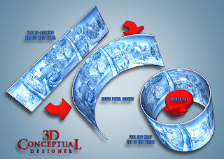
I printed this out on the color xerox and made a cylinder that you could stand-up and view to get the feel for the space in 3D[ it worked great!], a 2D version of Quicktime VR from the era in sketch format!  Here is a 3D Mock-Up to Illustrate this technique


A close up on the RIGHT side of the wrap with the Pavilion in center.


A close Up of the LEFT side of the wrap with the Queue for the Jungle Cruise.


Disney Interactive: VMK
Virtual Magic Kingdom DVD Game
Curvilinear Perspective Wraps

 Part VI

Client: Disney Interactive
Art Director: Myself
Project Date: Summer 1996

This is my sixth post in my series on the Virtual Magic Kingdom [ VMK] project I did for Disney Interactive back in 1996, and with this post, I cover a second perspective wrap that I did for a full 360 view from one of the game "Nodes".

They wanted a single sketch that would help them visualize the view from a specific point in the hub at the Virtual Disneyland Park we were making for the Virtual Magic Kingdom game so I did a sketch for each land.

You will notice that the artwork uses the fish-eye perspective grids I based on M.C. Eschers study of this drawing method, so I developed it to the project. I even taught the team curvilinear perspective to follow the theme we had for this game. A very fun time I had there with a great team, and now that I am back doing work for WDI, I pass by the old building on a regular basis.

You may review my earlier VMK posts in these link-a-dinks:

PART I
PART II
PART III
PART IV
PART V

Cheers, THOM
read more "Project Review: Virtual Magic Kingdom PART VI-Curvilinear Perspective Wraps"

Project Review: Tiberium 3D Logos and Illustrations PART II

A Logo provided by Calvin Sumler in Design as a vector, was then made three dimensional by me and executed in about six variations of metal crystal and a combo.


Here is a two level design with a larger holding device off the back in a cool green crystal material I built.


Using the same vector from above a one layer crystal with the "infection" scatter object technique to infect the lower section of the type.


I did a few ICON marks for Matt Stainner as well, and I "infected" them all with a variety of sizes and shapes of Tiberium crystals.


For this one I used the Molecular files I did for a few projects to give the logo an Electron Microscope POV feel to the executed 3D renders in Print and ready for AV motion Graphics as well.


This Last entry was a File from the Game Company that they wanted to see a few variations in colors on. We went with Orange to compliment the majority of green in all the comps. A Bio Hazard type of feel was achieved.

 TIBERIUM
3D Logos and 3D Illustrations
PART II

Client: EA- Entertainment Arts Video Games via The Cimarron Group.
Art Director(s): Matt Stainner[Prod], Calvin Sumler[AD]Project Date: Winter 2007.

While at Cimarron in 2007, I did a few pitches for the Video Game Division there, headed up by Matt Stainer, and Tiberium, and today I have posted PART II, with additional assets I created for the base pitch.

The game concept and work was very fun to execute, as I got to experiment with growing crystals onto my designs as an added layer of "infection" to the design.

Green Glass was the order of the day, in cool blue green, and lime green warm versions with red reflections as well. A fun time!


Cheers, THOM

To read about Tiberium from the Command and Conquer Series click here.

You can view my first entry on my design blog for Tiberium HERE.

read more "Project Review: Tiberium 3D Logos and Illustrations PART II"

Project Review Game Show Key Art for X-Box: 2011 PART II


 Here is the new Game Show Set full 3D Illustrated Cover Key Art for Who Wants to be a Millionaire for 2011.


 A very simple back cover frame made from the "2011 Edition" plaque used on the cover art above sized to the screen grab.


  A Lower 3rd type of asset, this Contestant row with stage floor was rendered out and used for the Key Art for the 3rd years offering of 'The Price is Right' X-box cover I have worked on for Nomadic.

 
 Here is the back cover frames for the assets and description, a quick pick-up render made after the front is signed off on as well.
 
 
Here is a line up [again] generously provided to me by my client Greg Orlowski at Nomadic.


Project Review
Game Show Key Art for X-Box: 2011 
PART II

Client: Nomadic
Art Director: Greg Orlowski and Wynn Burton.
Project Date: Summer 2011.

In this, my second post for the 2011 versions of Game show Key Art, I have two additional games to review, Who wants to be a Millionaire, and The Price is Right. PART I for 2011 is here.

The main logos for both were reused from the existing logos that were created by me for Greg and Wynn last season.
The X-Box Game Who Wants to be a Millionaire 2011, was a full set and a large build to do. Also, it required the longest rendertime as the entire floor was reflective and refractive, as it was purple plexiglass. Also, the podium is frosted plexiglass, so I used the Sub-Surface-Scattering material in Final Render, there as well to simulate the effect of the lights on the actual podium.

The second was a smaller project with a contestant row with some microphones as well as the old styled "LED" readout in front of the Real Time Characters from the game. I also provided assets for the back covers for the screen grabs from the video game itself, which is a usual pick-up jog after the Key Art for the covers is done.
You can view the 2010: Key Art that I did here.
You can view the 2009: Online game screens for the X-Box titles here.
 
You can view the 2009 original Key Art here.


Cheers, THOM
read more "Project Review Game Show Key Art for X-Box: 2011 PART II"

Project Review: Game Show X-Box Key Art 2011 PART I

 For 2011 I got a new Game Show title from Nomadic, the cover for Hole in Wall, for X-Box.


 Here is the back cover artwork for Hole in Wall, a re-purpose of a few items with a window wall for game shots[ typical]

 
 Here is the podium[ foreground element] used on the cover Key Art in front of  the 3D real time screen grabbed characters.


Here is the background bulb wall image used behind the foreground podium and characters on the cover for the 2011 edition of Family Feud.


Here is a line up generously provided by my client Greg Orlowski at Nomadic.


Project Review
Game Show Key Art for X-Box: 2011 
PART I

Client: Nomadic
Art Director: Greg Orlowski and Wynn Burton.
Project Date: Summer 2011.

I have had the pleasure of doing 3D Illustration work for Nomadic for about 5 years now, and every time, I have alot of fun with the subject matter.

I have done the last few years of Game Show Key Art 3D Illustration for the cover art front and back, so this year I had some additions to the existing logos that were reused from last season.

Today, in  PART I, I cover the Family Feud, and a new title this year, "Hole in Wall". I had a lot of fun working with Greg and Wynn again, a great client, helping to create the 3D assets that are used in their own final comps. We reused the logo, but all the foreground was new.

Next week, I plan to post the last two games shown in the above line up image, I did this season for them as well.

You can view the 2010: Key Art that I did here.

You can view the 2009: Online game screens for the X-Box titles here.
You can view the 2009 original Key Art here.


Cheers, THOM
read more "Project Review: Game Show X-Box Key Art 2011 PART I"
Copyright © interior car. All Rights Reserved.
Blogger Template designed by Big Homes.