Concept of Toyota's Car Design

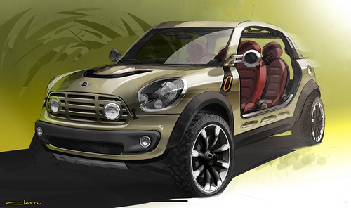
Toyota car design is striking and impressive making a strong presence on road. The cars designed are incredibly stylish to entice car buyers across the stretches. The car manufacturer adopts the philosophy of safety, environment, and social values when designing a car. With an aim to convey social considerations, background concept, and originalities through the design process, Toyota lays focus on its valuable philosophy.

The essentials of Toyota's design process are as follows:


J-Factor

J-factor is known to be the DNA of Toyota design that synergizes various conflicting elements in harmony and give dimensions to new values. It is the element that defines the Japanese design structure, aesthetics and values that blend seamlessly with the global standards. One very good example of synergizing the contradictory element is the combination of engine power and electric motor to create hybrid vehicles. Likewise, many other elements of a car are well harmonized to give a completely new look and feel to every car. The j-factor is the trademark of Toyota's car design and it delivers an extremely striking and magnificent appeal.

Miniaturization

Miniaturization is another good philosophy of Toyota's car design process. In this is embedded the intense art of Japanese craftsmanship that gives a deep insight to the complete universe in a small container. This means that even the smallest car by Toyota beholds a number of excellent features, technologies, and design concepts to keep the excitement alive on every drive. All the premium features along with ultra-high efficiency package of engine and transmission offers a sense of infinity. This concept is accepted and acclaimed worldwide as Japanese sensitivity.

Nature's Beauty

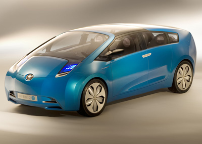
Nature's beauty is one most appreciating aspect of Toyota's design philosophy. The car manufacturer always moves in line with the nature's beauty and love. Japan follows the trend of infusing nature in craftsmanship and likewise the car manufacturer also adopts the same trend. Through unique way of conception, Toyota has been incorporating the beauty and love they behold for nature in their artistry method of car designing. A very good example of nature's love reflected through Toyota's car is the dashboard of the highly acclaimed car Pirus. The dashboard is much similar to the design or pattern found in the veins of a leaf and the resulting design is outstanding with a fresh and eternal feel. The energy of the nature is beautifully blended with the science of designing to give an eternally beautiful car design structure.
read more "Concept of Toyota's Car Design"

The Design Of Hatchbacks

There are a lot of different cars on the market. Each one has a slightly different shape to all the rest. Each shape has been designed specifically for that car. The idea is to make the car as attractive and aerodynamic as possible, especially your sports cars. Let us take a look at the purpose of the design of hatchbacks.

When you mention the term "hatchback" most people automatically think of cars that look like a sedan with the back cut off. This is not actually what makes a hatchback a hatchback. It actually refers to the internal design of the vehicle.

The design used by hatchbacks is a two box design. This means that the pillars of the car divide the interior into two main areas which are rectangular in shape. There is the engine compartment and there is the passenger and cargo compartment. Most of your sedans make use of a three box design in which the passenger and cargo compartments are separated into two different rectangles. In a three box design the main pillars of the vehicle are the ones that form the frame of the front and rear windscreens. They attach the roof to the base of the car. In a two box car the main pillar is the one that forms the frame of the front windshield. The two box is not less stable or more stable than the three box design, it is just different. You do not need to be concerned that hatchbacks are less safe to drive or have an accident in than sedans are. There are still the same number of pillars in the car to give it structural integrity, they are just placed differently.

You can get hatchbacks in one of two styles. There is the three door and the five door. The difference is the presence or lack of rear passenger doors. The lid of the boot is considered a door. The option you choose will depend on you and how easily you would like to be able to get gain access to the rear passenger seat.


The design of hatchbacks is meant to give an impression of space when in fact, there is no more space in a hatchback than there is in a sedan. It just feels larger because of the two box design. The cars tend to b a lot lighter than most sedans which means that they tend to be more economical than a sedan with similar specifications. This is the main attraction for a lot of people since saving money is quite a priority at this point in time.

The hatchback has been carefully designed to maximise the impression of space inside the vehicle. This was done by making use of the two box design. Hatchbacks are still just as safe to drive as they have the same number of support pillars for the roof as a sedan would, the pillars are just placed in a way that allows the passenger and cargo areas to be within a single rectangular section.
read more "The Design Of Hatchbacks"

Tips for Designing Good Car Window Decals

Using car window decals can be the perfect way to advertise your business to customers at a fraction of the price of other forms of advertising. Designing a good car window decal can be a challenging task, but if you follow the useful tips below you are sure to have a good-looking design window decal in no time.

Always Design to the Shape of the Window

Many people run the assumption that their cars windows are perfectly rectangular but this is almost never the case. When you are designing the window decals make sure you take accurate measurements of the surface you are going to apply it to. It is all too common for prints to be made that don't fit the window perfectly and this can look very unprofessional.


Never Put Text Near the Edge

Even if you have measured your window perfectly there is always the chance that some of it might get clipped off in the installation. This is okay if it is just a small amount of the background color, but if it is the phone number then the whole reason for getting car window decals is lost. It is also a good idea to make sure that your logo is centrally placed so that none of it is clipped off.

Don't Clutter the Decals

One of the most common problems people experience when designing car window decals is that they include too much information. There is quite a lot of space to cover on a car window so people feel the need to fill it all. Most passing motorists don't have the opportunity to read all the information so they will just want what is necessary, if it's not needed don't include it.

Make the Purpose Clear

When you have car window decals, some of your customers are going to be seeing the car when it's parked and they will have plenty of time to read it. Most of the time though your car will be in motion and will be being seen by other drivers. Your decals should have clear text describing what you do and how to get in touch with you, for one this will give drivers enough time to read it and secondly it will mean you are being responsible by not distracting other drivers.

Go to a Professional

It doesn't matter how much time you spend designing a great car decal if you go with a poor quality printer. Cheaper printers might not be able to get the colors exactly as you want them and their application of the window decal might not be perfect. There is nothing that looks more professional than a slanting phone number across the back of your car. You also run the risk that the ink from cheaper printers will start fading from sun exposure.
read more "Tips for Designing Good Car Window Decals"

How to Compete With a Computer in Designing New Car Models

Well, it's already starting to happen folks are using artificial intelligence coupled with the latest CADCAM software to design our future vehicles. Although many of these new designs look quite futuristic, and intriguing, there is a problem with all of this. They are all starting to look like giant teardrops, and the body lines are looking more and more familiar regardless of which model you buy. Yes, they say that humans love to imitate, and imitation is the highest form of flattery, but what about when the computers are doing it too?


Now then, I'd like to talk about this if I might because I think it's apropos to discuss where human beings will fit in, in the future of designing our automobiles.

Today, when one automobile manufacturer tries to copy another manufacture's body style, there are often lawsuits and patent wars in the courtroom. This is because if you are BMW, Mercedes, or some other manufacture you want to hold those patents and designs as unique to your brand, as it will help you sell more cars, especially when you stumble upon a certain body style that people like, and it sells well, you want to get all you can and sell as many vehicles as possible, hopefully millions, if not 10s of millions.

Of course, if your competition is copying what you are making, this cuts into the market share, and the number of people who are interested in buying that design or style of car. One of the issues with computers designing the perfect automobile for efficiency and fuel mileage is that there are only a few body styles which are ultimately the most efficient. With the new Federal CAFE mileage standards manufacturers are forced to keep their cars ultra efficient, however in doing so they are limited in that types of body styles they can use.

As these auto manufacturers go out of their way to file patents on these designs, it limits the consumer's choices. The good thing about all this is that it opens the doors for high mileage hybrids and electric cars that might not be the most efficient, but are designed by a human for human taste in style. This gives the advantage to the human being designing the car rather than an artificial intelligent CAD CAM software program which has been programmed to design the most efficient car first, and then secondly, one which fits the preference of the auto buyer.

Indeed I'd like you to please consider this from a philosophical standpoint, as I believe this topic and this discussion might help you design the very best future cars.
read more "How to Compete With a Computer in Designing New Car Models"

Designing the Cars of the Future One Question at a Time

Well, this may come as no surprise to you if you have ever done any collaborative work and brainstorming. The other day, we learned something very interesting in our think tank, at one of our regular local meetings at a local coffee shop. As a warm-up we had a quick brainstorm on the designing of cars for our future. Specifically we've been concerned that the Chevy Volt seems to have crashed (not literally, but production has been halted), the car costs too much, there are too few buyers, and it's just not pulling for all those 100s of millions of dollars invested in R&D and retooling. Okay so, let's talk about this, and let me explain what we learned through trial and error during our brainstorming session.


We first started with the typical concept of someone taking notes, and others just blurting out whatever came to their mind on new auto designs and ways to build our future cars. After 4 or 5 people spoke out in rapid succession one person asked; why does it have to have wheels?

Well, that completely sent all the other comments back to the drawing board, and we made a quick right turn if you will. Next folks were talking about hovercrafts, low pressure area, and the types of blowers that would be needed. Others began discussing how they would prevent all the noise from blowing out the driver's ear drums, and taking that noise and vibrational energy to power up all the other systems in the vehicle - noise recapture.

Then they started discussing the types of motors such as gasoline and diesel. And the same person who asked the question before asked; why does it have to run on liquid fuel?

Then we started talking about electricity, batteries, and gas type fuels like hydrogen. We decided that electric batteries were too heavy, but that the weight doesn't matter as much in a hovercraft, many of the hovercrafts are quite heavy. However, others still wanted to reduce the weight, and they started talking about how to redesign the batteries to be more efficient, lighter, and not use materials which were hard to get, or very costly.

As we began talking about body design styles, and braking systems because this vehicle would not have wheels, the same individual asked; why can't the body of the vehicle also help in the braking? One of the folks in the group was a former aerospace person, and we started talking about air brakes, spoilers, wing flaps, and things of this nature. Interestingly enough, just in our little brainstorming session we totally redesigned the future of human cars.
read more "Designing the Cars of the Future One Question at a Time"

practice..practice...


nothing new to show...random pieces...
read more "practice..practice..."

Opel 2030

read more "Opel 2030"

Project Review: S.W.A.T. the Movie 2003-PART III-Tactical Personnel Van

 A straight on back shot of the S.W.A.T. van that I built for the feature film marketing. This was designed around a few comps done by the team of Art Directors on the 'pod' for the project back in 2003 while at BLT and Associates as 3D Designer.


 A Worms Eye angle looking up with the back door on this SWAT van, with the back opened up with a few cast members coming at 'Ya.


 A low angled back view with a bit of 'dutch' on the camera, with the back closed up again.


 This overhead shot shows that all details were limited to what was seen in the renders so no front or even side details.


 I went to great detail to be accurate on the door locks and stays that keep the back doors open on these vans so that they would be accurate in style for the iconic vans used by S.W.A.T.


  Here is that back shot in polygons so you can see the level of detail that went into the individual parts on the van.


S.W.A.T. The Movie 2003PART III
The Tactical Personnel Van

Client: Columbia Pictures Inc. via BLT and Associates.
Art Directors: n/a
Project Date: Winter 2002-3.

It this third posting for the work I did for the TV to film adaptation of S.W.A.T., from almost a decade back now. I did this work while I was still an in-house 3D designer at BLT and associates back in 2003. I had done a couple dozen 3D Logos for the film posted here, as well as helping out with the teaser trailer.

In today s blog post we look at the back end of a typical Personnel van used by S.W.A.T. teams in the past, so they wanted an iconic look for the teaser with a van doors.

I built this 3D scene out as all hi-rez, as this was before I perfected my quad modeling techniques over the last decade,  and this was a fast turn around as usual so I did a speed model of the van.

I built out just the back of the van, and a bit of the sides, since we were just creating teaser shots for a few comps using the backside of this van for the posters.

I have a few more posts on S.W.A.T., that I will try and post up these in the future, so keep an eye out.

You can View the logos in PART I here.

You can view the M4 Carbine I built here for PART II

Cheers, THOM
read more "Project Review: S.W.A.T. the Movie 2003-PART III-Tactical Personnel Van"

Behind the Art: The Under Drawings PART II-ScoobyDoo


Here is the under drawing I did for the Scooby Doo Project with Heavy Iron from the 90's for this crypt area of the video game. You can view the final here


One of my favorite sketches for the Scooby Doo game, was this overhead on the above ground graveyard. Here is this final as delivered.


A Secret Laboratory[ final here ] in a rock cave from Scooby Doo the Video Game from the 90's.


The underdrawing I did for this shipwreck cove from Scooby Doo, with the final here.

Behind the Art
The Under Drawings
PART II Scooby Doo

Today I have posted PART II  in this new series of under drawings for various 2D projects.

The under drawing sets the look for the final in a way that is still rough enough to change and add details too, but also clean enough so that my "Non-Artist; clients can easily see the main direction, and enough of my intent to sign off on the next step with the details.

Today I have posed up four examples for the Scooby Doo project I did in the nineties for Heavy Iron Studios here in SoCal, and I posted that work here, if you are interested.

Now, the under drawings are not just a part of the way I create a piece for a client, but also an integral part of the process of approvals I have with them, so I can get sign off for the time consuming final line work stage as well as any thing else before time and $$ is used up on the details, without a clear picture of the overall look and proportions needed for the project.

 I usually put an under drawing over a hand made perspective grid I have made using ship curves, but for these examples, I put a quick grid on the under drawings themselves as seen above.

I do most of these on a 8.5 x 11 piece of generic copy paper, which is abundant and cheap for this. I usually do the final overlay on Clearprint or 'Vincent' Vellum.

You can view PART I of my under drawing posts here.


Cheers, THOM
read more "Behind the Art: The Under Drawings PART II-ScoobyDoo"

Project Review: X-Men 2: PART III-3D Logos from a Single Vector


 A double plate 3D Logo design I did for X-Men 2, with some mild pitting in the scratched steel face.


 A glass plate with a heavy bevel and a thin metal plate on top for this X-Men 2 Log I did back a decade ago.


 The top X-Men 3D Logo objects have a heavy thick bevel and the holding device has about half as much. Sitting on a gloss black surface.


 Here I did a hollow face logo for X-Men, with a very big bevel in a warm environment for lighting.


 Here is a deep extrusion coming up from infinity to reveal the above logo with a much deeper holding post.


 A solid two plate design with the X objects pulled out from a bit in 3D space for this X-Men 3D Logo.


 For this alternate I revered the type move and put the "2" out front, I also then cut out the insides to make a deep pocket in there for heavy shadows on a simple x, and a 2.


Project Review
X-Men 2: PART III
3D Logo Designs from a Single Vector File


Client: 20th Century Fox Via BLT and Associates.
Art Director: Zack Ris
Date: Spring 2001

I had well over 200 logos I did for X-Men 2 from a decade back now, when I was an in-house 3D  Designer over at BLT and Associates, and today I have details on one sub-set all based on a single Vector file.

Part of what was great over at BLT, was that an Art Director would give me a single vector file designed in 2D, and also give me plenty of design space to create a dozen solves, not just one. 

Since I am versed in 3D design space,and most importantly, I was taught to think in three dimensions via my Industrial Design Degree from A.C.C.D., I always see a flat vector in multiple solves at delivery in 3D. I usually drop a few suggestions to an Art Director, but typically I do just one design for each logo, but here on X-Men 2, I had time to do about twelve per vector file.

I will be posting a few more solves from other vectors in the future for this X-Men 2 series I have here on my design blog.

You can view PART I here and PART II here, or you can search the blog using X-Men to see my X-Men 3, and First Class stuff as well.


Cheers, THOM
read more "Project Review: X-Men 2: PART III-3D Logos from a Single Vector"

Old Ferrari stuff


read more "Old Ferrari stuff"

straight ahead


read more "straight ahead"

Project Review: Drive Angry 2011: Blue-Ray-3D Animated Menus

 Here is a final frame from the HD animation for the FBI Badge and leather case.


 Because the Drive Angry badge spins we do see the back so this is a full 360 degree model.


 Here is the Polygon view with mesh smooth ON to see the basic form of the model.


 A "Virtual" necklace worn by Billy Burke as Jonah King in Drive Angry used in the menus.


 Here is the low poly model of the necklace from Drive Angry.


 Here we see it with the mesh-smooth [subdivision added] applied to the above base mesh.


Project Review
Drive Angry 2011 PART I
Blue-Ray-3D Animated Menus

Client: via  Summit Home Entertainment via The Cimarron Group.
Art Director: Brian Larson.
Project Date: February 2011.

About one year ago I did my last job for The Cimarron Group, who were my full time employers for about six years from late 2003 to October 2009. As budgets dropped so did my contributions to Blue Ray Menus, but for Drive Angry, I got the call, and helped render out nearly 500 HD frames of animation for the menus for Brian Larson,with whom I have done a few projects posted here with in the past.

In this PART I posting, I have two main props from the film I recreated in 3D, and I also animated the assets to fly into camera and hit the virtual windshield, our TV screen, as you make your choices in the menu.

In the film there is a Devil Worshiping Cult Leader who is the nemesis of Nick Cage in the film, and I built out his necklace from the film, all Sub-D, as well as the badge for the "Accountant" who is chasing him down from Hell with an FBI badge that magically appears, with his coin toss[ I did that too look for a PART II soon]. William Fichtner does an outstanding job as 'The Accountant', IMO.

Cheers, THOM
read more "Project Review: Drive Angry 2011: Blue-Ray-3D Animated Menus"
Copyright © interior car. All Rights Reserved.
Blogger Template designed by Big Homes.