Project Review: Piranha 3D 2009-PART II:3D fish Illustrations

 Here is the base fish I built out for Piranha 3D, and in a few Hrs it was ready to render.


 The first shot I did of Virtual Piranha was a swarming shot no specific direction.


 This shot the Piranha came at camera


 A fast swim shot going to a single point in a straight on perspective for Piranha 3D.


 Here is the same basic shot pulled back with 4X the fish in the shot.


 I dropped the camera on that last shot to look up to the swimming hotty added into the comp in this last one from back in 2009 for the first remake of Piranha.


PIRANHA 3D
PART I I 3D Fish Illustrations

Client:Dimension Films via The Cimarron Group.  
Art Director(s): Brian Lauzon, Chris A. Hawkins, Rob Russell.  
Project Date: Fall and Winter 2009.

In this second posting for my contributions to the Key Art for the Remake of Piranha 3D back in 2009, I cover the fish themselves I did for the project.

After seeing the Posters for the next one, Piranha 3DD, I see that there is nothing new under the sun, as this direction was used in the 70's and again in 2009[ as seen above], and again now in 2012.

At the time I started, we did not have good scrap for the fish so I built a modified regular Piranha to adjust it to use for the comps presented. The fish itself, was a fast mock up in 3D and I did a few variations with bends and turns so I had about 5 to 6 different fish to scatter about. I did get the shot from the film but we did not update the renders due to budgeting.

Most of these were done for Art Director Brain Lauzon, and he provided some sketches for base direction as he had a series of ideas that had the fish going up, back, and right at us.


This is a perfect fit for 3D Illustration, as I know many an Art Director cutting out fish and doing a 200 layer PSD comp to achieve this with photo-scrap, whereas in 3D I merely move the camera lights and pose the fish to get exactly what is needed in a single render.

You can review my first set of 3D logos in the first Posting here.

Cheers, THOM

read more "Project Review: Piranha 3D 2009-PART II:3D fish Illustrations"

Project Review: Sand's Bethworks: PART II-Icon Design Iron-worker sketches.

 I ended up turning the head in this early 2D sketch at us, for this sketch with the Iron-Worker lifting the beam in place.

 A wide across the body hold on the I-beam for this Iron-Worked Idea.


 An across the body held tight shot was my second favorite idea. Easier to make an Icon with a tighter compact design like this.


 Here is the final Idea as an overlay for the Iron-Worker hammering in a spike into the flat beam which would be the logo holding device in some form like these.


A re-post image from the MMA fighter I did for, Will Ragland at Ragland Inc. The execution was to be identical in nature to what I gave Will. It was to be quad modeled and built in iron.


Sand's  BETHWORKS
Bethlehem PA.
PART II

Clients The Sands via The Cimarron Group.
Art Director: Darren Keller and Andrew Marciniak
Project Date: Summer 2007.

This is the second post for a new Casino proposal built in an old steel mill in Bethlehem PA, and for this second posting I am putting up my little gesture sketches I did for the Iron-worker Idea they pitched.

I did a few quick Ideas with an Iron-worker and a metal I-Beam in hand being carried and finally being hammered as the final. I planned on doing a stylized model like what was executed for Fighters Only project, that I did for Ragland Inc. here, so it was to be a metal sculpt of the icon.

They wanted to pose it alot and since it is a molded model, the time factor was not conducive, so they went to just the 3D logos. 


Very Fun Project all in all.

You can view PART I here.

Cheers, THOM
read more "Project Review: Sand's Bethworks: PART II-Icon Design Iron-worker sketches."

Project Review: Launch City PART VIII[ 8th]-The Target Jukebox Design 1999.

Here is the original final shot for Launch CD-zine Issue #40 from 1999 @ 640 x 480 the size limit at the time fro shockwave to run smoothly.


I did a quick open and re-render at a higher rez to show some details[missing a few maps though after 14 years...]


Here is the main screen shot in geometry showing the model details I added in.


The set was a two wall configuration and I built a little conduit with the parked gum pushed up in the crack.


Here is a shot of the full to the floor jukebox as geometry for Launch.com

 Launch City Part VIII
The Target Jukebox design for Issue #40

Client: Launch Media Inc.
Art Director: Myself
Project Date: 1999

In this 8th post on LAUNCH city, I am posting work done on a jukebox built out for a Target sponsored space with a fully animated 3D jukebox.

This was one of my very first projects I worked on when I joined the three man team as Art Director in 1999. I love to model in 3D, and that seems to be something that many people do not like. 
 
To me the fun part is the build itself. I love the process of construction. This may be due to the fact that I am an avid woodworker, copper smith, and I love to sculpt and create, so naturally I would love virtual building too.
 
I made the model close to, but not exact to a famous iconic Juke box from the 50's for the project, and I passed it over to Cayce Justus and he skillfully rigged it up and animated the arm and curtains inside for me.
As a point in 3D history this is the project where I made a material editor breakthrough in 3DSmax with Chrome and Glass and applied it here in the default scan-line rendered. 
 
Remember this was 14 years back, pre GI and all the good render tools we know see as commonplace were not out yet, so lots of ambient lights to simulate bounce etc.

Cheers, THOM

To view PART I on Launch City you can go here.

To view PART II go here.

To view PART III for the Train Station "Twitch" look here.

To view PART-IV look here.

To view PART V- you can click here.

To view PART VI [ the sub!] go here. 

To view PART VII-The Vault, go here.


read more "Project Review: Launch City PART VIII[ 8th]-The Target Jukebox Design 1999."

Project Review: Mean Girls 2004: Motion Graphics 3D Logo design

 Round one had clean simple type done in diamonds and platinum for Mean Girls in 2004.

 A shot of the bracelet on black with the satin removed as an alternate for the MGFX design.

 This is the final that finished at 4K for the International Trailers.

 Here is a shot of the final image in quads showing the build.

 A low angle shows off how much I moved the letters around to fit the pink cloth final finished logo for Mean Girls.

  Here is a shot of the quad model showing. the welds I built into the chain links using the nPower tools.

Project Review
Mean Girls 2004: Motion Graphics 3D Logo design


Client: Paramount Pictures via The Cimarron Group.
Art Direction: Michelle Jackino and Erik Counter.
Project Date: Spring 2004.

My very first early Motion Graphics piece from my days at The Cimarron Group from 2003-2009, was done while Michelle Jackino ran the AV division, and I had the pleasure to work with the in-house Predator Erik Counter on Mean Girls.

Mean Girls needed a charm bracelet, fully built as the 3D logo for the piece, so I proceeded to begin my design in 3D. I started very straight and flat, but later on was directed to  really move the letters around so we put it on some pink cloth and I modeled it to conform to the shapes. It ended up finishing for the International Trailers.


Cheers, THOM
read more "Project Review: Mean Girls 2004: Motion Graphics 3D Logo design"

Personal Project Napkin Sketching and Doodles Part XIX[19th]

 I added more stories to the quick doodle design I did here.[ I will keep adding height!]

These three little characters I designed are trouble!

A sad dark robot a bit depressed and worried.


I did this little snowman head right after the holiday season.

Personal Project
Napkin Sketching and Doodles Part XIX[19th]
 
 In this nineteenth installment of the Napkin Sketches, Drawings, and Doodles I do when I have a pen or pencil in hand, I have put up some more.

These doodles are quick ideas as well, usually 3-5 minute sketches as a speed challenge. I also often repeat and re-do concepts to refine them a bit like seen above. It is just like I do on a paid project, only it is spread out over days rather than doing twenty or so sketches of little robots in one afternoon, I do one a night for a week, with each one taking queues' from the last.

Today I have put up a 5 story version on the mini swamp house I have done before, only this round it is even taller. I will keep going to ridiculous then stop!

I also have a bunch of characters including the "Manny, Moe, and Jack-esque' three friend grouping. Each is very different from the other, but they are a matched set.

You can view the other parts as follows:
PART I
PART II
PART III
PART IV
PART V
PART VI
PART VII
PART VIII
PART IX 
read more "Personal Project Napkin Sketching and Doodles Part XIX[19th]"

Project Review: Star Trek:The Original Series: Motion Graphics for DVD sets 2004

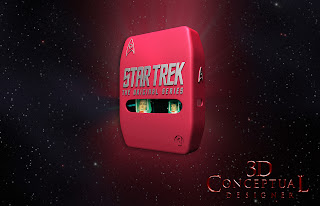
 Frame 001 of the DVD case from Season 2 for Star Trek that I built and animated in 3D for the Home Entertainment release back in 2004.

 Frame 45 into the animation as it turns slow to camera...


 Near the end it flips in 10 frame fast to reveal the embossed badge in the back of the case[ Boolean!]


 Frame 001 from Season three for the DVD set release from Paramount Home Entertainment back in 04'


 This one was a slow roll[ gimbal] so it had 320 frames to the animation.


 Here is the model itself front and back in an ambient shader.

 Here is a quad model view of the box I built for the MGFX move, a screen grab from 3DSmax.


Project Review
Star Trek:The Original Series Seasons 2, and 3
Motion Graphics for DVD sets

Client: Paramount Home Entertainment via The Cimarron Group.
Art Direction: Myself and the whole team.
Project Date: October 2004.

I did an occasional Home Entertainment job while at The Cimarron Group, usually as pick-up work, so for this project, Paramount designed these new molded plastic cases and wanted to do a camera move on them so I built them using the nPower Power Solids modeler to get the complex case built fast enough to use in the animation moved that I rendered for the job. I did season two, and three, in blue and red corresponding to the colors for the uniforms from the original TV show.

The delivery was 450 frames at DV rez and I alpha channeled all files so the Motion Graphics team could drop my 3D into he piece for finishing simple enough. 

Nice thing is they change the packaging every few years so the work is always there cycling through.


Cheers, THOM
read more "Project Review: Star Trek:The Original Series: Motion Graphics for DVD sets 2004"

Project Review: The Phantom 2040-PART LXXXXIV[94th]-More Female Character Designs


The character NIA[ here] from The Phantom 2040, had a few outfit changes as she had a secret identity and this was her "Lab Outfit" she hid in for the series.


Kit Walkers friend Jenna, had many an outfit change herself, even a spacesuit, and here is a prom dress for her I designed.


Here is a 3rd  design for a character for 'downtown' near Cyberville, you can view a few added designs here, and here.

 Here is the last generic female character I did for the series.


Phantom 2040-PART LXXXXIV[94th]
More Female Character Design Drawings

Client: Hearst Animation Productions.
Art Director: Myself.
Project Date Spring 1993.


This is my 94th posting for my work done on the Television 2D Animated Series, The Phantom 2040 from in the early ninety's, and today I have posted a few character designs, as well as a few fashion designs I did for the female characters for the series.

When you design an entire world of the future, you cover everything you can, from architecture, Transportation,and Product designs, Fonts, graphics, and fashion designs. Hearst gave a big allowance to buy resource materials for the fashion design work, so I got up to speed on some current trends back in the 90's from Paris, to emulate my future versions for Metropia.

I also had a few 'sexy girls' they wanted to populate here and there in the city as well, especially at the party's downtown near Cyberville in the second season, it was a bit of a 'seedy' neighborhood, so they wanted some, "ladies' walking around down there.

Are you a FAN of The Phantom 2040, and on FACEBOOK, there is a group  here.

There is a TAG on the list to the RIGHT for other Phantom 2o4o entry's, but you can click this as well.

Cheers, THOM
read more "Project Review: The Phantom 2040-PART LXXXXIV[94th]-More Female Character Designs"

Project Review: SALT: PART III-3D Logo Exploration 2008

 A 3D design based on vectors provided to me by Chris A. Hawkins for this Sub Surface Lit example with the Soviet themed Red wax material.


 This design uses three plates high for the triple edge highlight in brushed metal, and the face is a bit curved as well to get the nice highlight in the proper place.


 I did a deep extrusion here, but I like the thin decal look I did above as well, as an alternate.


 The hammer and sickle for the "A" was a great solve in my opinion from Chris for this design, with gold and red materials.


 A bright graphic version of the logo with the "star" used for the "A", this was a thin extrusion version. I added the neon around the star to be an animation element for AV-MGFX.


 A deep extrusion on the above vector using the procedural cement-metal material I designed in Dark Tree. Big bevels!


 A Single-Point-Beveled[SPB] font here with a warm to cool lighting on just the extremities. This was to be an animated face in from black idea for a living one sheet.


 A SPB built into a tube with some mild ribbed design elements put on the red glass material.


A round tube built font with tech shapes cut into the object all the way through with some internal metal accents as well.


SALT
3D Logo exploration
PART III

Client: Columbia Pictures via The Cimarron Group.
Art Director(s): Chris A. Hawkins.
Project Date: Winter 2008.

In my third posting here on my design blog, for the 3D design work that I did for the film, SALT in the winter of 2008 while still running the 3D Department at Cimarron. Today I focus on logos for one of the three main Art Directors I did work for in the Poster Design department there, Chris A. Hawkins.

With this added set of logo you can see that I had a very wide range to play in for the film. I also had a full day to do these so I could really finesse the details and the lighting. I have glass and metal, procedural-textures, lots of single point beveled text, that is fully hand modeled, and some Sub-Surface-Scattering in there too since I had the time[ long renders to get right!].
 
Total Logo count that I provided to them was, One-hundred fifty-five[ 155] designs, though they presented maybe five to the client at the end, I always love the process so I understand the drastic cuts needed. Young designers take note, that 5 out of 155 is the norm for a firm to cut down your delivery.

You can view PART I here.
You can view PART II here.
You can also view the KGB badge I made here.

Cheers, THOM
read more "Project Review: SALT: PART III-3D Logo Exploration 2008"

Project Review: Black Hawk Down DVD Packaging 3D Illustrations 2002.


 Initial direction had the look of the X-Men Posters I did for them, but it was not a fit for the film, though we were directed to do a pass that felt clean glossy and superhero-ish.


 Here is the 3/4 polygon view showing that I exaggerated the depth for the 3D Illustration as a stylization technique.


 A explode view of the above model shot the various Allen bolts "O-rings" and plates that made up the first pass design.


 Here is the first pass at the military metal with rivets and rust, that was picked.


 Here you can see the three variations I did because I used procedural textures I merely changes a slider or two and hit render again, this is the power you will find in a procedural map on a short deadline like we get in Home Entertainment design projects.


Project Review:
DVD Packaging 3D Illustrations 2002.


Client: Columbia Tri-Star Home Entertainment via BLT and Associates.
Art Director: John Cua.
Project Date:  August 2002.


While I was still in-house at BLT and Associates, one the the larger Theatrical Advertising houses in Los Angeles, I was put on the Home Entertainment divisions packaging for Black Hawk Down due to be released on DVD.I had worked with Matt Rice and his team on a few Key Art projects, but this was an inner sleeve concept we pitched to the client and it did finish.

They wanted to create artwork that would fit behind a clear plastic back-plate that holds the DVD disc, so I did a quick concept that had an X-men feel as directed; Super glossy chrome and brushed metals , but they thankfully changed to a more beat up rusted military look as seen in the film.

To achieve this I used Dark Tree's Simbiont max plug in and did the rust procedural. The main reason was this was to be a three disc set and I wanted each back plate to have a unique look to the rust without having to hand paint the textures[ no time!], and with a procedurals, you can change the 'seed' values and density to achieve 3 fully unique rust looks with a touch of a button and a hit render.

Cheers, THOM
read more "Project Review: Black Hawk Down DVD Packaging 3D Illustrations 2002."
Copyright © interior car. All Rights Reserved.
Blogger Template designed by Big Homes.